Jobs Form
Building the Form
Section titled “Building the Form”Now, that we have a way of displaying our applications, we need a way of adding new ones.
First, let’s take a look at our final design in Figma, and what we’re building.
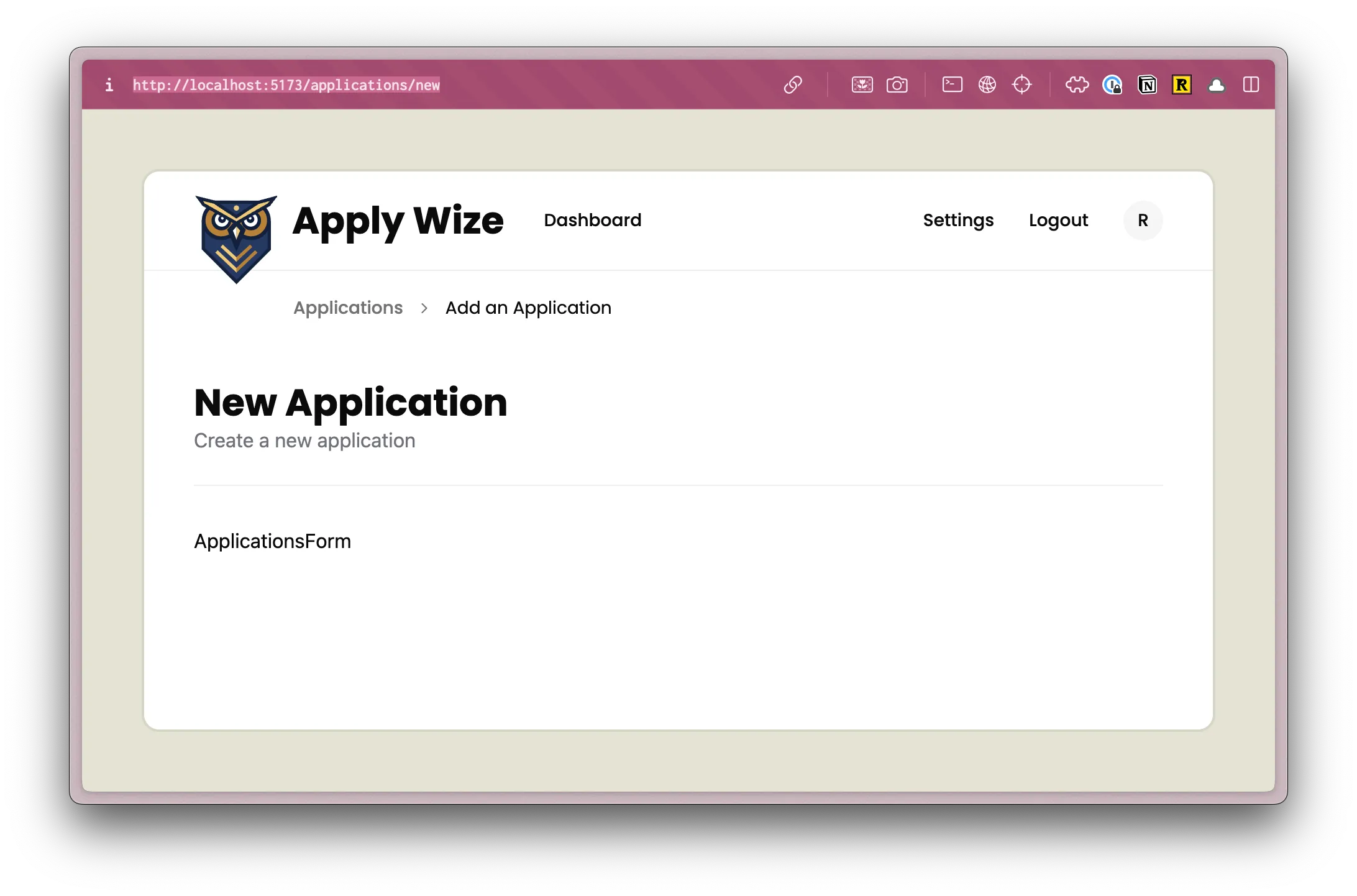
In the last section, we set up the /applications/new route, but we haven’t created the page.
Inside the src/app/pages/applications folder, let’s create a new file called New.tsx.
Directorysrc/
Directoryapp/
Directorypages/
Directoryapplications/
- New.tsx
We can stub out a basic component:
const New = () => { return ( <div>New</div> )}
export { New }In order to see the changes that we’re making in the browser, we need to update our worker.
render(Document, [4 collapsed lines
index([isAuthenticated, Home]), layout(AuthLayout, prefix("/user", userRoutes)), route("/legal/privacy", () => <h1>Privacy Policy</h1>), route("/legal/terms", () => <h1>Terms of Service</h1>), layout( InteriorLayout, prefix("/applications", [ isAuthenticated, route("/", List), route("/new", () => <h1>New Application</h1>), route("/new", New), route("/:id", () => <h1>Application</h1>), ]) ), ]),Originally, we defined our /new route, returning an h1 element that said “New Application”. Let’s change that to return our New component instead.
Then, be sure to import the New component at the top of the file:
import { New } from "./app/pages/applications/New";Inside our New component, let’s start building our page.
Left Side
Section titled “Left Side”At the top, we have breadcrumbs, helping the user know where they are and navigate back.
Conveniently, shadcn/ui has a Breadcrumb component that we can use. We’ve already imported this component into ou project, we just need to use it.
Just like the Applications Table, let’s start by copying and pasting the implementation code directly from shadcn/ui’s documentation into our component:
import { Breadcrumb, BreadcrumbList, BreadcrumbItem, BreadcrumbLink, BreadcrumbPage, BreadcrumbSeparator,} from "@/app/components/ui/breadcrumb";
const New = () => { return ( <div> <Breadcrumb> <BreadcrumbList> <BreadcrumbItem> <BreadcrumbLink href="/">Home</BreadcrumbLink> </BreadcrumbItem> <BreadcrumbSeparator /> <BreadcrumbItem> <BreadcrumbLink href="/components">Components</BreadcrumbLink> </BreadcrumbItem> <BreadcrumbSeparator /> <BreadcrumbItem> <BreadcrumbPage>Breadcrumb</BreadcrumbPage> </BreadcrumbItem> </BreadcrumbList> </Breadcrumb> New </div> );};
export { New };Now, let’s start modifying the code to fit our needs.
<Breadcrumb> <BreadcrumbList> <BreadcrumbItem> <BreadcrumbLink href="/">Home</BreadcrumbLink> <BreadcrumbLink href={link('/applications')}> Applications </BreadcrumbLink> </BreadcrumbItem> <BreadcrumbSeparator /> <BreadcrumbItem> <BreadcrumbLink href="/components">Components</BreadcrumbLink> </BreadcrumbItem> <BreadcrumbSeparator /> <BreadcrumbItem> <BreadcrumbPage>Breadcrumb</BreadcrumbPage> <BreadcrumbPage>Add an Application</BreadcrumbPage> </BreadcrumbItem> </BreadcrumbList> </Breadcrumb>- I’ve adjusted the first
BreadcrumbLinkto point to the Applications index or list page. - We can get rid of the
<BreadcrumbSeparator /> - We can get rid of the second
<BreadcrumbItem>. - For the third
<BreadcrumbItem>, I’ve changed the label fromBreadcrumbtoAdd an Application.
Since we’re utilizing the link function, we’ll need to import it at the top of the file:
import { link } from "@/app/shared/links";At the top of the src/app/components/ui/breadcrumb.tsx file, we need to add a use client directive to specify that our shadcn/ui component is a client component, otherwise our page will error out.
"use client";Let’s add some styles to our wrapping div:
return ( <div className="mb-12 -mt-7 pl-[120px]">11 collapsed lines
<Breadcrumb> <BreadcrumbList> <BreadcrumbItem> <BreadcrumbLink href="/applications">Applications</BreadcrumbLink> </BreadcrumbItem> <BreadcrumbSeparator /> <BreadcrumbItem> <BreadcrumbPage>Add an Application</BreadcrumbPage> </BreadcrumbItem> </BreadcrumbList> </Breadcrumb> </div>);- I added
48pxof margin on the bottom withmb-12 - I put a negative margin of
28pxon the top to move the breadcrumbs up. - I added
120pxof padding on the left.
Next up, let’s add our page heading:
<> <div className="mb-12 -mt-7 pl-[120px]">11 collapsed lines
<Breadcrumb> <BreadcrumbList> <BreadcrumbItem> <BreadcrumbLink href="/applications">Applications</BreadcrumbLink> </BreadcrumbItem> <BreadcrumbSeparator /> <BreadcrumbItem> <BreadcrumbPage>Add an Application</BreadcrumbPage> </BreadcrumbItem> </BreadcrumbList> </Breadcrumb> </div> <div className="mx-page-side pb-6 mb-8 border-b-1 border-border"> <h1 className="page-title">New Application</h1> <p className="page-description">Create a new application</p> </div></>- We can only return a single component, so we need to wrap everything with React fragment (
<></>) - On the
div, we have a few classes that adjusts the spacing and adds a border to the bottom.mx-page-sideuses our custom utility class to add40pxof padding on the left and right.pb-6adds24pxof padding on the bottom.mb-8adds32pxof margin on the bottom.border-b-1 border-borderadds a border to the bottom of thediv.
- Here, we've added an
h1that says "New Application" and has a class calledpage-title - Then, we have a
pof text that says "Create a new application." I went ahead and added a class ofpage-descriptionso that we can use this on multiple pages.
We need to add a class definition for page-description to the @layer components section of our styles.css file.
@layer components {4 collapsed lines
.page-title { @apply text-3xl; }
.page-description { @apply text-zinc-500; }This sets the default color of our page-description to a light gray, using class provided by Tailwind.
Moving down the page, we have a two column form. There are parts of our form that will need state and interactivity, meaning our component will need to be a client component. Instead of making the entire page a client component, let’s create a separate component, just for our form.
Inside the src/app/components folder, let’s create a new file called ApplicationForm.tsx.
Directorysrc/
Directoryapp/
Directorycomponents/
- ApplicationForm.tsx
Stubbing out our component:
"use client";
const ApplicationForm = () => { return ( <div>ApplicationForm</div> )}
export {ApplicationForm}You'll notice I also placed the use client directive at the top of the file, converting this file to a client component.
Before we start building out our Application Form, let’s add it to the New.tsx file.
import { ApplicationForm } from "@/app/components/ApplicationForm";28 collapsed lines
import { Breadcrumb, BreadcrumbList, BreadcrumbItem, BreadcrumbLink, BreadcrumbPage, BreadcrumbSeparator,} from "@/app/components/ui/breadcrumb";import { link } from "@/app/shared/links";
const New = () => { return ( <> <div className="mb-12 -mt-7 pl-[120px]"> <Breadcrumb> <BreadcrumbList> <BreadcrumbItem> <BreadcrumbLink href={link("/applications")}> Applications </BreadcrumbLink> </BreadcrumbItem> <BreadcrumbSeparator /> <BreadcrumbItem> <BreadcrumbPage>Breadcrumb</BreadcrumbPage> </BreadcrumbItem> </BreadcrumbList> </Breadcrumb> </div> <div className="mx-page-side pb-6 mb-8 border-b-1 border-border"> <h1 className="page-title">New Application</h1> <p className="page-description">Create a new application</p> </div> <ApplicationForm /> </> );};Now, let’s go back to our ApplicationForm component and wrap our <div>ApplicationForm</div> with a form tag and add some styles:
return ( <form> <div className="grid grid-cols-2 gap-[200px] px-page-side mb-[75px]"> ApplicationForm </div> </form>);- On our
div, I added a class ofgridand gave it two columns,grid-cols-2. I also put a200pxgap between the two columns. - On the left and right side, I added
40pxof padding with our custom utility class,px-page-side. - Finally, I added
75pxof margin on the bottom withmb-[75px].
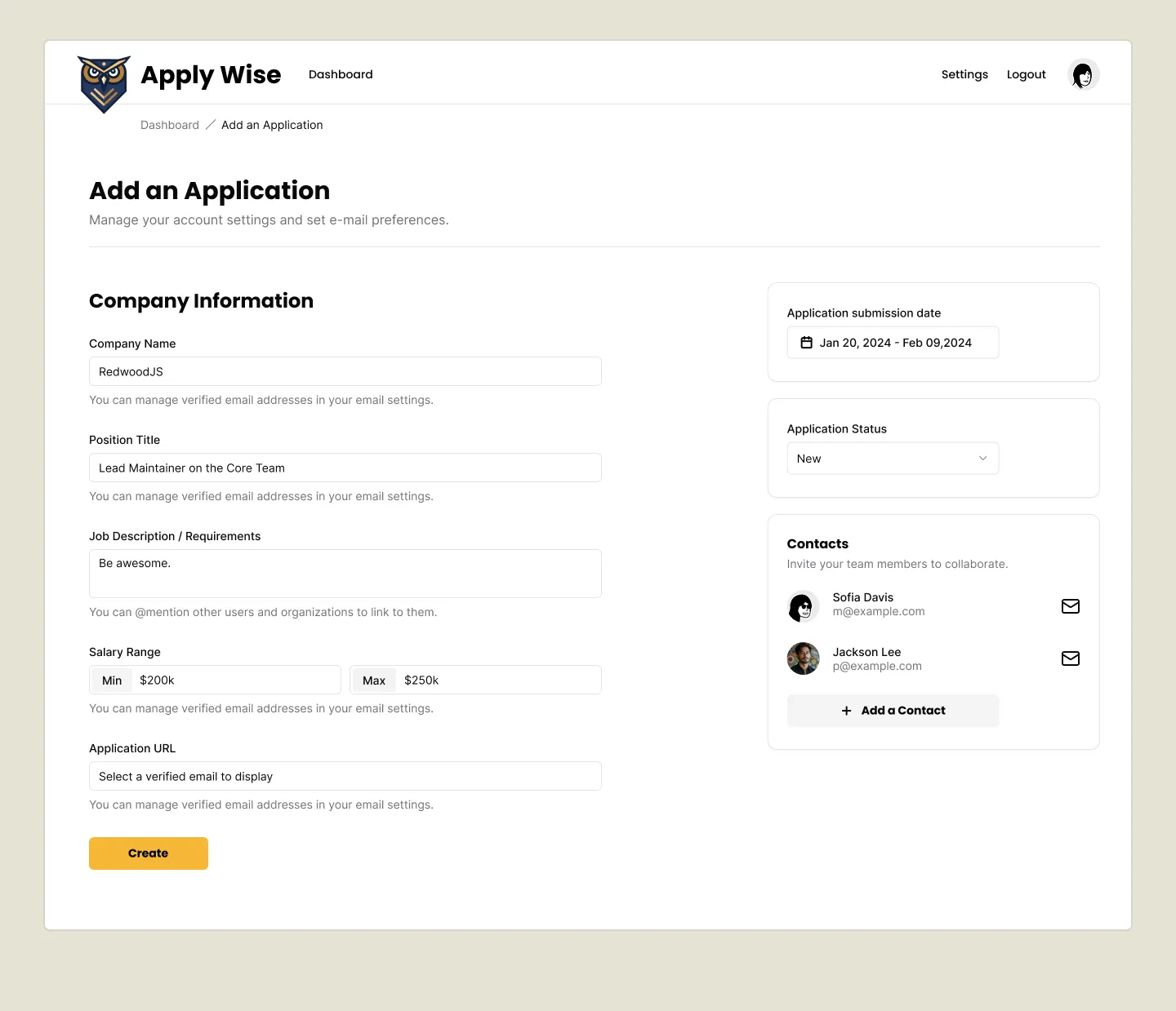
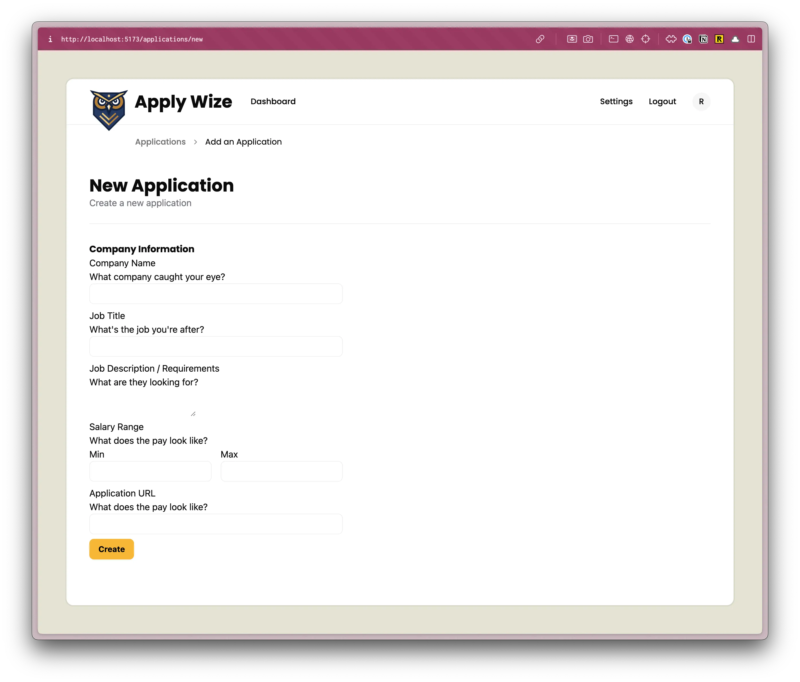
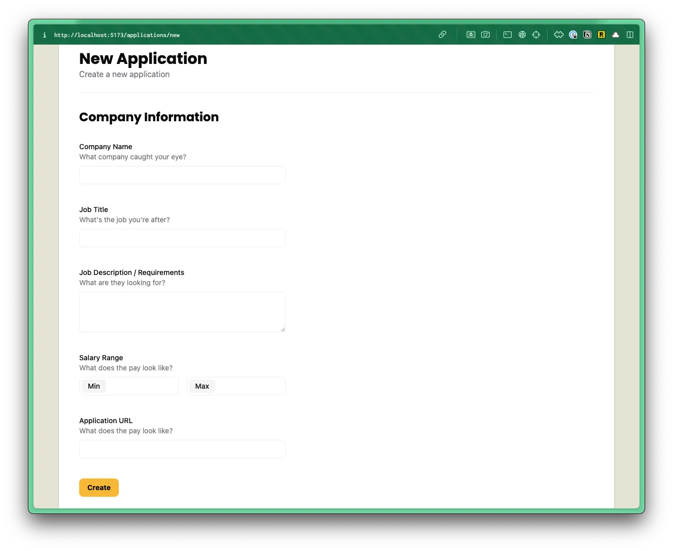
If you check the /applications/new route in the browser, you’ll see our breadcrumbs and page heading:
Now, let’s start building out our form.
<form> <div className="grid grid-cols-2 gap-[200px] px-page-side mb-[75px]"> {/* left side */} <div> <div> <h2>Company Information</h2> <div className="field"> <label htmlFor="company">Company Name</label> <p className="input-description">What company caught your eye?</p> <input type="text" id="company" name="company" /> </div> <div className="field"> <label htmlFor="jobTitle">Job Title</label> <p className="input-description">What's the job you're after?</p> <input type="text" id="jobTitle" name="jobTitle" /> </div> <div className="field"> <label htmlFor="jobDescription">Job Description / Requirements</label> <p className="input-description">What are they looking for?</p> <textarea id="jobDescription" name="jobDescription" /> </div> <div className="field"> <div className="label">Salary Range</div> <p className="input-description">What does the pay look like?</p> <div> <div> <label htmlFor="salaryMin">Min</label> <input type="text" id="salaryMin" name="salaryMin" /> </div> <div> <label htmlFor="salaryMax">Max</label> <input type="text" id="salaryMax" name="salaryMax" /> </div> </div> </div> <div className="field"> <label htmlFor="url">Application URL</label> <p className="input-description">What does the pay look like?</p> <input type="text" id="url" name="url" /> </div> <div className="field"> <Button role="submit"> Create </Button> </div> </div> </div>
{/* right side */} <div>
</div> </div></form>You’ll also need to import the Button component from shadcn/ui at the top of the file:
import { Button } from "./ui/button";This is a big chunk of code, but it should be pretty straightforward. It’s a standard form, using HTML labels and inputs with fields for:
- Company Name
- Job Title
- Job Description / Requirements
- Salary Range (min and max)
- Application URL
- Submit Button
One of the things that I like to do when building out my form components is to wrap each field (the label, description, and input) with a div that has a class of field. This makes it easy to control the layout and spacing of each field.
You’ll also notice that on each p tag, I added a class of input-description. Since there are multiple input descriptions, this will make it easier to style since we can target the class name from our styles.css file.
If you look at this in the browser, it should look like this:
Now, let’s add some basic styling.
Inside the style.css file, below the h1, h2, h3 styles, let’s add some more styles for h2:
h2 { @apply text-2xl font-bold;}text-2xlsets the font size to24px.font-boldsets the font weight tobold.
For our .field class, let’s stick this inside the @layer components.
@layer components { .field { @apply pt-8; }pt-8adds32pxof padding to the top.
For our label and .label classes, let’s stick this inside @layer base:
label,.label { @apply text-sm font-medium block;}text-smsets the font size to14px.font-mediumsets the font weight tomedium.blocksets the display toblock.
We already have an input definition within our @layer base, so we can just add to it. But, it specifically targets the text type, so let’s extend it to include other input types, as well as, textarea.
textarea,input[type="email"],input[type="date"],input[type="url"],input[type="text"] { @apply border-border border-1 rounded-md px-3 h-9 block w-full mb-2 text-base;}Let’s add a few more classes for our textarea. These need to be listed below our input definition, so that we can override some of our input styles:
textarea { @apply h-[80px] py-3;}h-[80px]gives the textarea a height of80px.py-3adds12pxof padding on the top and bottom.
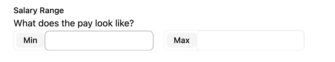
Minimum and Maximum
Section titled “Minimum and Maximum”For the minimum and maximum salary fields, we have to add a few custom styles in order to get the “Min” and “Max” labels to appear inside the input.
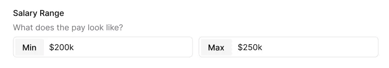
Salary min and max within Figma.
Let’s revisit the JSX and see what our existing code looks like:
<div className="field"> <div className="label">Salary Range</div> <p className="input-description">What does the pay look like?</p> <div> <div> <label htmlFor="salaryMin">Min</label> <input type="text" id="salaryMin" name="salaryMin" /> </div> <div> <label htmlFor="salaryMax">Max</label> <input type="text" id="salaryMax" name="salaryMax" /> </div> </div></div>We can add a class of flex gap-4 to the div wrapping our inputs to get the minimum and maximum inputs aligned side by side:
<div className="flex gap-4"> <div> <label htmlFor="salaryMin">Min</label> <input type="text" id="salaryMin" name="salaryMin" /> </div> <div> <label htmlFor="salaryMax">Max</label> <input type="text" id="salaryMax" name="salaryMax" /> </div></div>For the div wrapping the label and input, let’s add a class of flex-1 label-inside. This will make the minimum and maximum inputs an equal width. Then, the label-inside is a custom class that we can target within our CSS.
<div className="flex gap-4"> <div className="flex-1 label-inside"> <label htmlFor="salaryMin">Min</label> <input type="text" id="salaryMin" name="salaryMin" /> </div> <div className="flex-1 label-inside"> <label htmlFor="salaryMax">Max</label> <input type="text" id="salaryMax" name="salaryMax" /> </div></div>In our styles.css file, inside the @layer components section, let’s add the following:
@layer components {4 collapsed lines
.field { @apply pt-8; }
.label-inside { @apply relative flex border border-border outline-1 outline-white rounded-md mb-2 h-9; }- We can set the position to
relativeand the display toflex. border border-borderwill give thediva border that has a color ofborder, defined in the@themesection.outline-1 outline-whiteadds a white outline to thediv. By using theborderandoutlineclasses together, we can almost make it look like there are two borders.rounded-mdadds a border radius of4px.mb-2adds8pxof margin on the bottom.h-9gives thediva height of36px.
We can use CSS nesting to target the label and input within the label-inside class.
.label-inside { @apply relative flex border outline-1 outline-white border-border rounded-md mb-2 h-9;
label { @apply text-sm font-medium px-3 bg-[#f4f4f5] rounded-sm center my-1 ml-1; }
input[type="text"] { @apply border-none flex-1 relative top-1 outline-none focus:border-none focus:outline-none h-auto; }}- On the
labeltag:- We've made the text small (
14px) withtext-smand a medium font weight (font-medium). bg-[#f4f4f5]makes the background a light grayrounded-smadds a border radius of4pxcenteris our custom utility that centers the text inside thelabelmy-1adds8pxof margin on the top and bottom andml-1adds4pxof margin on the left.
- We've made the text small (
- For the
inputtag:border-noneremoves the borderflex-1makes the input take the full width of the containerrelative -top-[2px]moves the input up2px,relativeto its current positionoutline-none focus:border-none focus:outline-noneremoves the border and border
The border around the wrapping div makes it look like the label is inside the input. But, really, it’s just a div wrapping a label and an input.
In order to maintain the illusion, we also have to remove the default border and outline from the input. We also need to change the border color on the div when the input inside is focused.
.label-inside {10 collapsed lines
@apply relative flex border border-border outline-1 outline-white rounded-md mb-2 h-9;
label { @apply text-sm font-medium px-3 bg-[#f4f4f5] rounded-sm center my-1 ml-1; }
input[type="text"] { @apply border-none flex-1 relative top-1 outline-none focus:border-none focus:outline-none h-auto; }
&:has(input[type="text"]:focus) { @apply outline-2 outline-[#919191]; }}- The
&allows us to "attach" the:haspseudo-class to thelabel-insideclass. This is the same as writing.label-inside:has(input[type="text"]:focus). - The
:haspseudo-class says when the input inside is focused, apply anoutlineof2pxand a color of#919191.
Now, let’s style the input-description. We can add this to the @layer components section:
.input-description { @apply text-sm text-zinc-500 mb-2;}text-smsets the font size to14px.text-zinc-500sets the color to gray. This is a Tailwind color class.mb-2adds8pxof margin on the bottom.
Awesome, this completes the left side of our form.
Now, let’s write the code for the right side.
Right Side
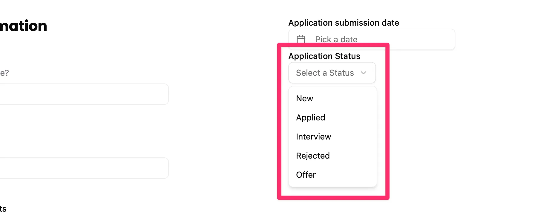
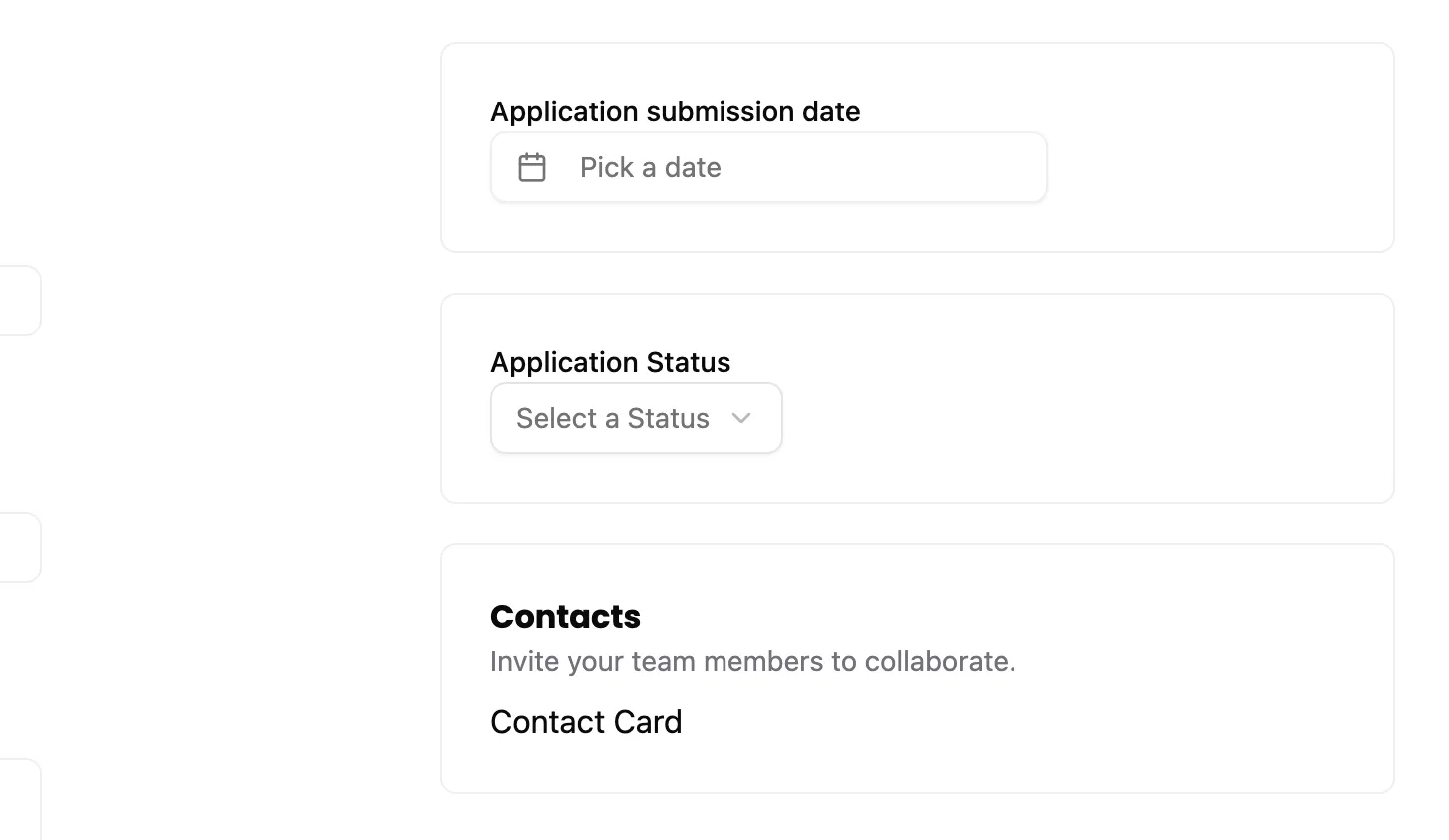
Section titled “Right Side”Looking at the design in Figma, we have 3 boxes.
- Application submission date, with a date picker
- Application status, with a dropdown
- Contacts list
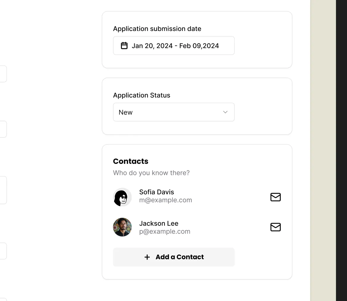
For most of these pieces, we can use existing shadcn/ui components.
I’m going to use a wrapping div with a class of box to wrap each of these sections.
{/* right side */}<div> <div className="box"> <label>Application submission date</label> <DatePicker name="dateApplied" /> </div></div>Our DatePicker component is a shadcn/ui component, so we’ll need to import it at the top of our file:
import { DatePicker } from "./ui/datepicker";Now, you may have noticed that we have a linting error on our DatePicker component.
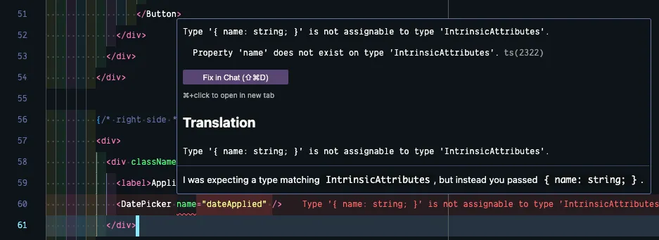
We need a way of setting the name for our input element, but currently, this component doesn’t accept any props. Let’s change that!
Open your src/app/components/ui/DatePicker.tsx component and add a name prop. This is a type of string.
export function DatePicker({ name }: { name: string }) {Now, we need to do something with it. If you skim through the code, it’s saving the selected date in a piece of state, defined at the top of the component:
const [date, setDate] = React.useState<Date>()We can use that in conjunction with our name prop! Scroll down to the bottom of the DatePicker component, right after our closing </Popover> tag. We’ll create a hidden input. We can give our input the name that we passed in as a prop and set the value to the date that we’re saving in state.
22 collapsed lines
<Popover> <PopoverTrigger asChild> <Button variant={"outline"} className={cn( "w-[280px] justify-start text-left font-normal", !date && "text-muted-foreground" )} > <CalendarIcon className="mr-2 h-4 w-4" /> {date ? format(date, "PPP") : <span>Pick a date</span>} </Button> </PopoverTrigger> <PopoverContent className="w-auto p-0"> <Calendar mode="single" selected={date} onSelect={setDate} initialFocus /> </PopoverContent></Popover><input type="hidden" name={name} value={date?.toISOString()} />You probably noticed, we’re formatting the date value.
- The
?says, “if thedateis defined, then format it”. - The
.toISOString()method converts thedateto a string in ISO 8601 format.
Now, our component is returning two children, so we’ll need to wrap our entire return statement with a React Fragment:
return ( <>23 collapsed lines
<Popover> <PopoverTrigger asChild> <Button variant={"outline"} className={cn( "w-[280px] justify-start text-left font-normal", !date && "text-muted-foreground" )} > <CalendarIcon className="mr-2 h-4 w-4" /> {date ? format(date, "PPP") : <span>Pick a date</span>} </Button> </PopoverTrigger> <PopoverContent className="w-auto p-0"> <Calendar mode="single" selected={date} onSelect={setDate} initialFocus /> </PopoverContent> </Popover> <input type="hidden" name={name} value={date ? date.toISOString() : ""} /> </> )}Moving on to the next box, we have the Application Status:
<div>5 collapsed lines
<div className="box"> <label>Application submission date</label> <DatePicker name="dateApplied" /> </div>
<div className="box"> <label htmlFor="application-status">Application Status</label> <Select name="status"> <SelectTrigger> <SelectValue placeholder="Select a Status" /> </SelectTrigger> <SelectContent> <SelectItem value="new">New</SelectItem> </SelectContent> </Select> </div></div>Here, we’re using a shadcn/ui Select component. We’ll need to import this at the top of our file:
import { Select, SelectContent, SelectItem, SelectTrigger, SelectValue,} from "./ui/select";Let’s give a deeper look to the shadcn/ui Select component. You can also check out the official documentation.
The Select component has a trigger (SelectTrigger). This is essentially a button that opens the dropdown. Here, I’m using the placeholder prop to set the text to “Select a Status.”
The content (SelectContent) is the dropdown menu. For now, I only have one option in the dropdown, “new”. This will eventually need to be dynamic, pulling all our application statuses from our database.
Our ApplicationForm component is a client component. But, we need to use a server component in order to fetch all of the application statuses from the database. If we go up the chain, he ApplicationForm component’s parent is the New page component, which is a server component. Let’s fetch the data there and pass it into the ApplicationForm.
On our New page component, we want to import our database and use a Prisma query to get all the applications statuses:
import { db } from "@/db"
const New = async () => { const statuses = await db.applicationStatus.findMany()Still inside the New.tsx file, scroll down to the ApplicationsForm component and pass in the statuses as a prop.
<ApplicationsForm statuses={statuses} />At first, you’ll see an error because we need to set up our ApplicationForm to receive the data:
import { ApplicationStatus } from "@/db"
const ApplicationsForm = ({ statuses }: { statuses: ApplicationStatus[] }) => {You'll notice for the status type, we can reference the ApplicationStatus type that Prisma generated for us. It's an array of statuses, so we'll append square brackets []
Now, we can use the statuses we’re passing in to make our Select component dynamic. We want to loop over all of our statuses and display a SelectItem for each:
<Select name="status"> <SelectTrigger> <SelectValue placeholder="Select a Status" /> </SelectTrigger> <SelectContent> {statuses && statuses.map(status => ( <SelectItem key={status.id} value={status.id.toString()}> {status.status} </SelectItem> ))} </SelectContent></Select>- Whenever you're using a
mapfunction within React, you'll need to provide akeyprop. - For the
value, we need to convert theidto a string. - We're displaying the name of the status
{status.status}within the browser, but the value that's sent to the server is theid.
Test this out in the browser. If you click on the Application Status dropdown, you should see all the statuses that we seeded the database with. 😍
Now, let’s set up the basics for our Contacts box. We’ll set up the bare minimum now, and revisit this in the next section.
<div className="box"> <h3>Contacts</h3> <p className="input-description">Invite your team members to collaborate.</p> <div> Contact Card </div></div>- Similar to what we've done before, we have a
divwith aclassNameofbox. Inside, we have ah3heading for Contacts and aninput-descriptionproviding some additional information. - Instead of displaying all our contacts, though, I'll just include some placeholder text: "Contact Card"
Now, let’s work back through the right side content and add some styles. Head over to our styles.css file.
First, inside our @layer components, let’s style our box.
@layer components { .box { @apply border border-border rounded-md p-6 mb-5; }- We want a
borderwith a color ofborder - Give it rounded corners with
rounded-md - Put
24pxof padding on all sides withp-6 - Put
20pxof margin on the bottom, withmb-5.
This looks pretty good, but I want to add some spacing between the form label and its input. With the form fields on the left, we have an input-description to add space. So, when we’re targeting our class within CSS, we want to target labels, but only labels that don’t have an input-description.
Inside the @layer base section, right below our label, .label selectors (keeping all our label styles together), let’s add a new CSS block:
label,.label { @apply text-sm font-medium block;}
label:not(:has(+ .input-description)) { @apply mb-2;}- The
:hasblock allows us to look for a label that has aninput-descriptionright next to it (+). But, since we want the opposite, where it doesn't have aninput-description, we can use the:notpseudo-class. mb-2adds8pxof margin on the bottom.
Now, that our form is in a good place, let’s handle the form submission.
Handling Form Submission
Section titled “Handling Form Submission”In React 19, several new hooks were introduced for handling form submission, especially with client and server side components.
You’ll remember, our AddApplicationForm component is a client component, but we want to handle our form submission on the server.
In a traditional React application, we’d have to create an API endpoint, and then use a fetch request to handle the form submission. With React 19, we have a lot more options.
For this form, we’re going to use a simple server action. The nice thing about this particular approach is that it degrades gracefully.
First, within our ApplicationForm component, let’s tell our form what to do.
<form action={handleSubmit}>Now, we need to write the handleSubmit function. Still within the ApplicationForm component, before our return statement:
const ApplicationForm = ({ statuses }: { statuses: ApplicationStatus[] }) => { const handleSubmit = async (formData: FormData) => { const result = await createApplication(formData); if (result.success) { window.location.href = `/applications`; } else { console.error(result.error); } };
return ( <form action={handleSubmit}>- Since this is calling a server action, we can use
async/await. - By default, this function will receive all the
formDatathat the user entered. - Then, we'll call the
createApplicationfunction (this doesn't exist yet, we still need to write this) passing in theformData. We can save the return value in a variable calledresult. - If the
createApplicationfunction returnssuccessastrue, we'll redirect the user to the applications page that lists all the applications. - Otherwise, there's an error and we'll log it to the console.
Now, let’s set up the createApplication function we referenced. Create a file for our action. Inside, the src/app/pages/applications folder, let’s create a new file called functions.ts.
Directorysrc/
Directoryapp/
Directorypages/
Directoryapplications/
- functions.ts
- List.tsx
- New.tsx
At the top of our functions.ts file, we need the "use server" directive to ensure our code runs on the server (see the React documentation on this for more info).
"use server";Then, create a function called createApplication.
export const createApplication = async (formData: FormData) => { try {
return { success: true, error: null }; } catch (error) { console.error(error); return { success: false, error: error as Error }; }}- You'll notice we're
exporting the function so that we can use it in ourApplicationFormcomponent. - Since this is a server action, we can use
async/await. When the time comes, we'll want toawaitour database call. - This function accepts all the
formDatawe collected. -- Form Data is part of the Web API (further documentation on MDN) - We set up a
try/catchblock. Inside thetryblock we'll eventually add our database call. Assuming that works, we'll return an object withsuccessastrueanderrorasnull. - If there's an error, we'll
catchit, log it to the console, and return an object withsuccessasfalseand the error itself.
OK! Now, let’s add that database call.
try { await db.application.create({ data: { user: { connect: { id: "f8886f0e-fa1a-485a-9239-e066c0672bf9", }, }, status: { connect: { id: parseInt(formData.get("status") as string), }, }, company: { create: { name: formData.get("company") as string, contacts: { create: { firstName: "John", lastName: "Doe", role: "Hiring Manager", }, }, }, }, salaryMin: formData.get("salaryMin") as string, salaryMax: formData.get("salaryMax") as string, jobTitle: formData.get("jobTitle") as string, jobDescription: formData.get("jobDescription") as string, postingUrl: formData.get("url") as string, dateApplied: formData.get("dateApplied") as string, } })
return { success: true, error: null };}- You can use the
db.application.createfunction from theapplicationSeed.tsfile as a starting point. - We're getting all the data from the form and assigning it to the appropriate database field.
- The only field that might not be obvious is the
status. We're getting thestatusvalue from the form, where it's a string. However, the database needs theidto be an integer. So, we're usingparseIntto convert the string to an integer.
- The only field that might not be obvious is the
- We haven't set up
contactsyet, for now we'll hard code in some test data. For everything else, you can useformData.get("FIELD_NAME")to get the value of any field. Then, assign it to the appropriate property on thedataobject.
You’ll also need to import the db object at the top of your file:
import { db } from "@/db"Before looking at this within the browser, make sure that you go back to the ApplicationsForm component and import the createApplication function at the top of your file:
import { createApplication } from "@/app/pages/applications/functions"Now, let’s test this out. Fill out the form, click the “Create” button, and you should be redirected to the applications page and see your new application in the list. 😎

Our user id is still hard coded in:
user: { connect: { id: "f8886f0e-fa1a-485a-9239-e066c0672bf9", },},Let’s update this to make it dynamic.
We can access the current user by importing the requestInfo object. This contains information about the current request, including our ctx, where we have a user object. (Further information within the sdk/worker docs.)
"use server"

import { requestInfo } from "rwsdk/worker";import { db } from "@/db";
export const createApplication = async (formData: FormData) => {  try {
    const { ctx } = requestInfo;

    if (!ctx.user) {      throw new Error("User not found");    }
    await db.application.create({      data: {        user: {          connect: {
            id: ctx.user.id,          },        },
Test this out again and everything should still work. 🥳
Further reading
Section titled “Further reading”- Read about how-to guides in the Diátaxis framework