Create the Application
Project Generation and Structure
Section titled “Project Generation and Structure”The first thing we’ll do is set up our project.
npx create-rwsdk applywizecd applywizenpm installnpm run devnpx create-rwsdk applywizecd applywizepnpm installpnpm devnpx create-rwsdk applywizecd applywizeyarn installyarn run devThis will create a new RWSDK project called applywize, inside a directory called applywize, using the standard starter project template, install the dependencies, and run the development server.
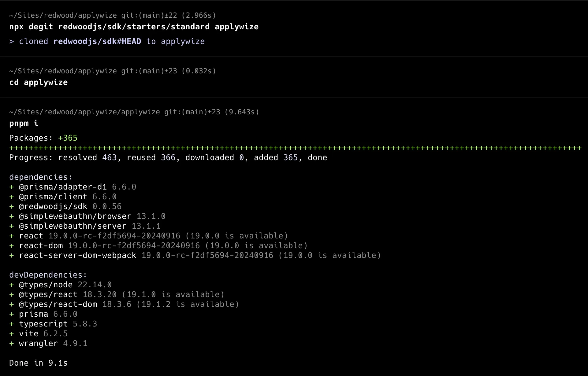
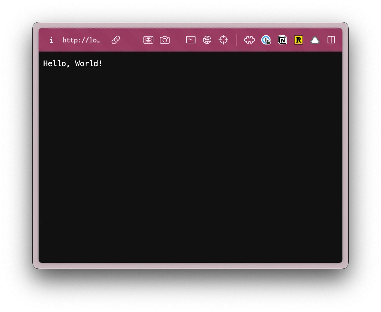
The developer server will typically be running on http://localhost:5173.
If you check it out in the browser! You’re up and running!
Inside, the applywize directory, you should have a bunch of different files and folders.
Don’t worry about understanding every file right now. Here are the key ones:
src/app/pages/- Where we’ll build our application pagesprisma/schema.prisma- Database structure
If you want to see the full project structure, here it is:
- .cursor # Cursor rules
- .devcontainer # Devcontainer configuration
- .vscode # VSCode configuration
- .wrangler # Cloudflare configuration
Directorygenerated
- prisma # generated Prisma files
Directorymigrations # database migrations
- 0001_init.sql # initial migration
- node_modules # dependencies
Directoryprisma # prisma configuration
- schema.prisma # database schema
Directorysrc
Directoryapp
Directorypages
Directoryuser
- functions.ts # authentication functions
- Login.tsx # Login page
- routes.ts # authentication routes
- Home.tsx # Home page
Directoryshared
- links.ts # list of links
- Document.tsx # Main HTML document
- headers.ts # Sets up page headers
Directoryscripts
- seed.ts # seed the database
Directorysession # sets up sessions for authentication
- durableObject.ts # sets up a Cloudflare Durable Object for a session
- store.ts # sets up a store for working with sessions
- client.tsx # initializes the client
- db.ts # database client
- worker.tsx # Cloudflare worker
Directorytypes
- rw.d.ts # Redwood types
- vite.d.ts # Vite types
- .dev.vars # environment variables for Cloudflare development
- .env # environment variables
- .env.example # example environment variables
- .gitignore # files to ignore in git
- package.json # lists all the dependencies and scripts
- pnpm-lock.yaml # lock file for pnpm (assuming you’re using pnpm)
- README.md # project overview
- tsconfig.json # TypeScript configuration
- vite.config.mts # Vite configuration
- worker-configuration.d.ts # Generated types based on your worker config
- wrangler.jsonc # Cloudflare configuration
At first glance, this might feel a little overwhelming, but as we build out our project, it will be easy to see how all the pieces fit together.
Our Database
Section titled “Our Database”The first time you run pnpm dev, it creates the .wrangler directory. This directory is used by Cloudflare’s Miniflare (your local Cloudflare environment). It contains your local database, caching information, and configuration data.
Setting up TailwindCSS and shadcn/ui
Section titled “Setting up TailwindCSS and shadcn/ui”Let’s start by installing TailwindCSS and shadcn/ui.
TailwindCSS is a utility-first CSS framework that makes it easy to style your components. This means instead of writing custom CSS files, TailwindCSS lets us style components directly in our HTML using pre-built classes like text-red-500 or bg-blue-100. This makes styling faster and more consistent.
shadcn/ui components is a library of pre-built components making it easier for us to focus on the functionality of our app, rather than the styling and building of components.
TailwindCSS
Section titled “TailwindCSS”Since the RedwoodSDK is based on React and Vite, we can work through the “Using Vite” documentation.
-
Install Tailwind CSS
Terminal window npm i tailwindcss @tailwindcss/viteTerminal window pnpm add tailwindcss @tailwindcss/viteTerminal window yarn add tailwindcss @tailwindcss/vite -
Configure the Vite Plugin
vite.config.mts import { defineConfig } from "vite";import tailwindcss from '@tailwindcss/vite'import { redwood } from "rwsdk/vite";import { cloudflare } from "@cloudflare/vite-plugin";export default defineConfig({environments: {ssr: {},},plugins: [cloudflare({viteEnvironment: { name: "worker" },}),redwood(),tailwindcss(),],}); -
Import Tailwind CSS. (You’ll need to create the
src/app/styles.cssfile.)src/app/styles.css @import "tailwindcss"; -
Import the CSS file at the top of your file and include a
linktag in theheadof theDocument.tsxfile.src/app/Document.tsx import styles from "./styles.css?url";...<head>...<link rel="stylesheet" href={styles} />...</head> -
Now, you can run
pnpm run devand go tohttp://localhost:5173/user/login.Terminal window npm run devTerminal window pnpm run devTerminal window yarn run dev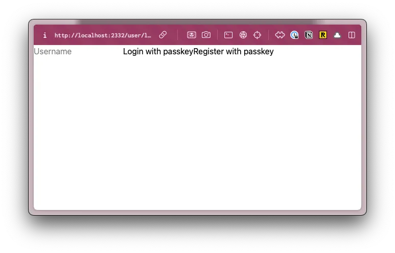 For reference, before adding TailwindCSS, the login page looked like this:
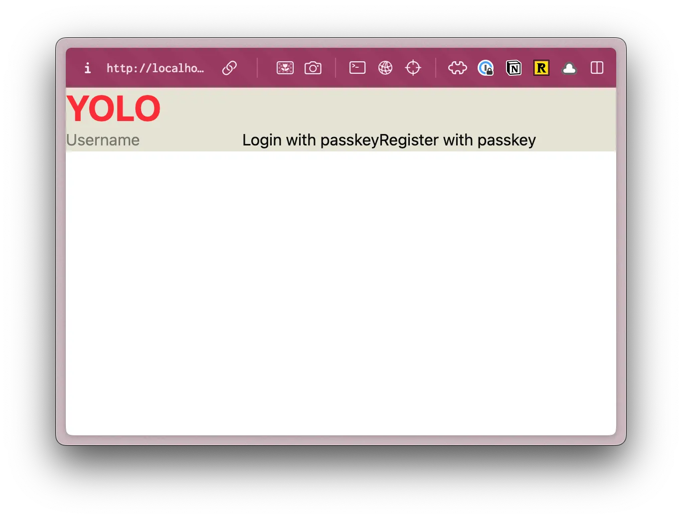
You can test this even further by going to the src/app/pages/user/Login.tsx file and adding an h1 at the top of the return statement:
return ( <> <h1 className="text-4xl font-bold text-red-500">YOLO</h1>14 collapsed lines
<input type="text" value={username} onChange={(e) => setUsername(e.target.value)} placeholder="Username" /> <button onClick={handlePerformPasskeyLogin} disabled={isPending}> {isPending ? <>...</> : "Login with passkey"} </button> <button onClick={handlePerformPasskeyRegister} disabled={isPending}> {isPending ? <>...</> : "Register with passkey"} </button> {result && <div>{result}</div>} </>);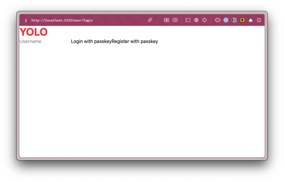
Setting up Custom Fonts
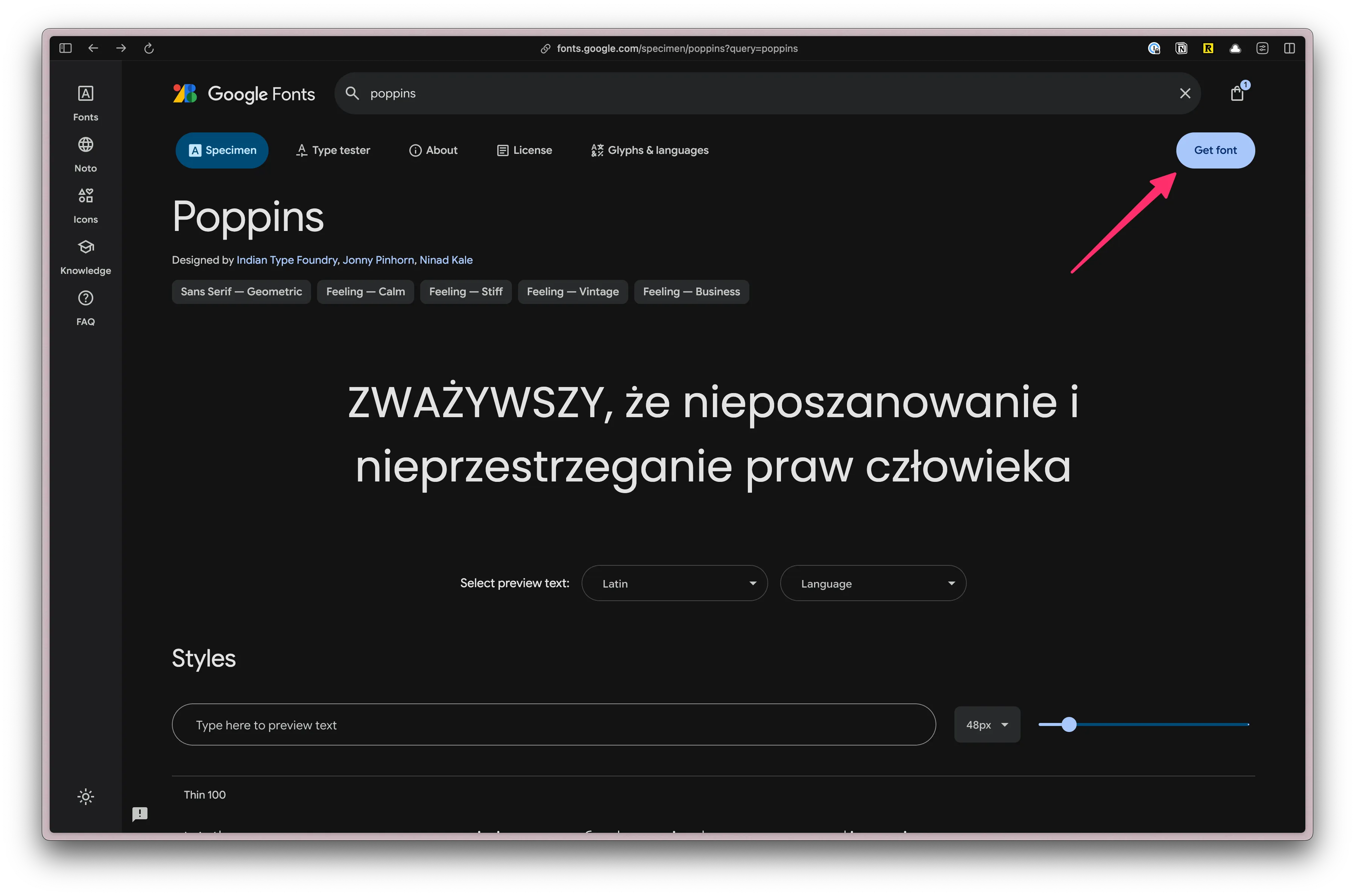
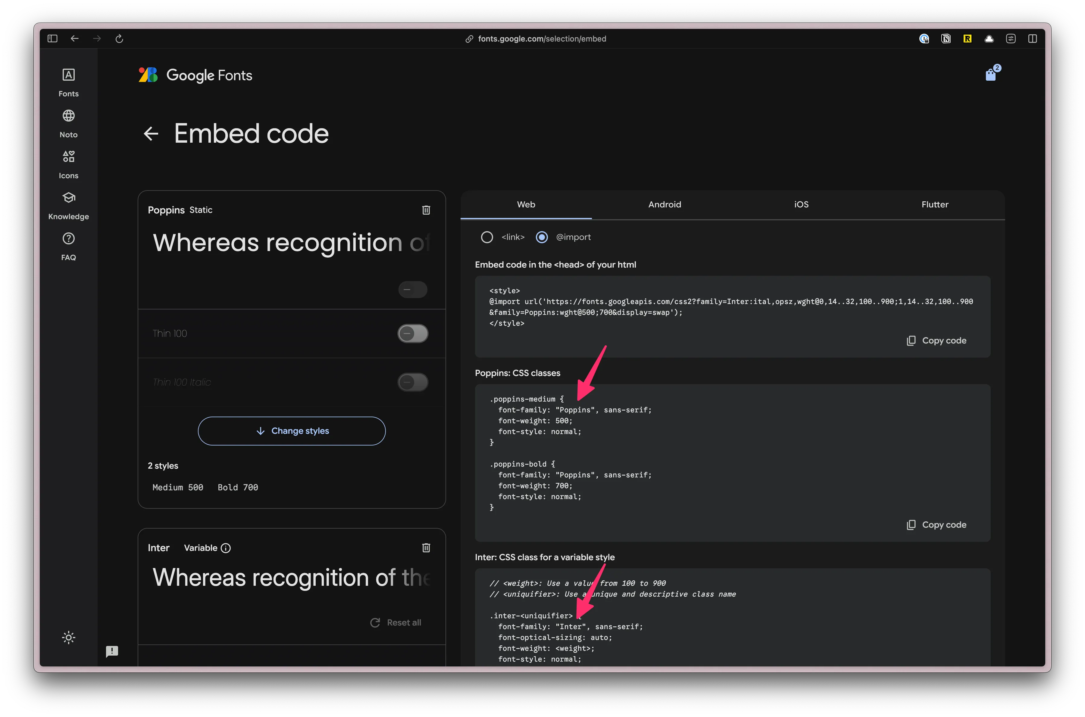
Section titled “Setting up Custom Fonts”First, let’s add the fonts that we’ll need for our project. We’re using Poppins and Inter, both can be found on Google Fonts.
From the font specimen page (for both fonts), click on the “Get Font” button.
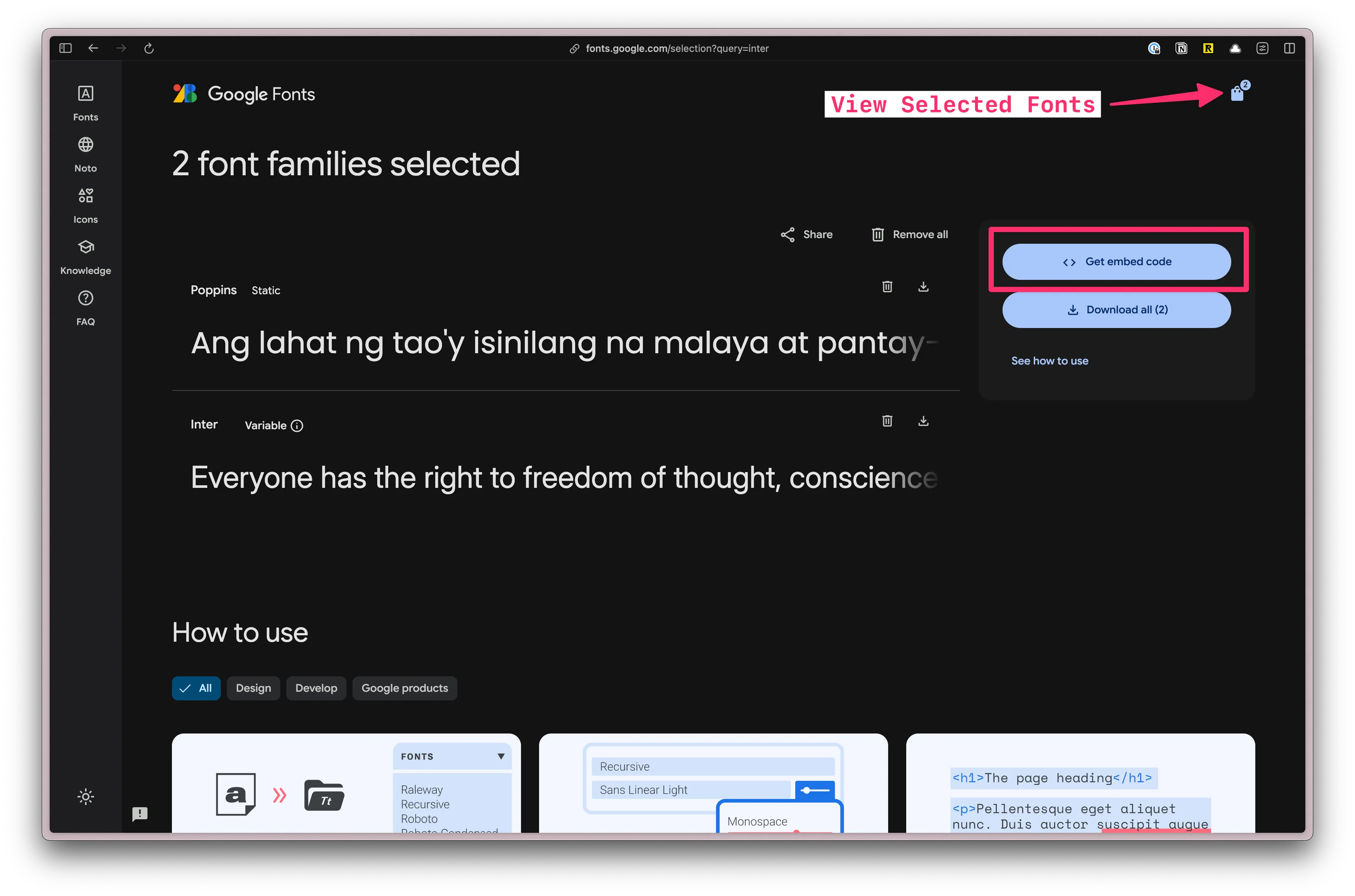
Once both fonts have been added, click on the “View selected families” button on the top right. Then, click on the “Get Embed Code” button.
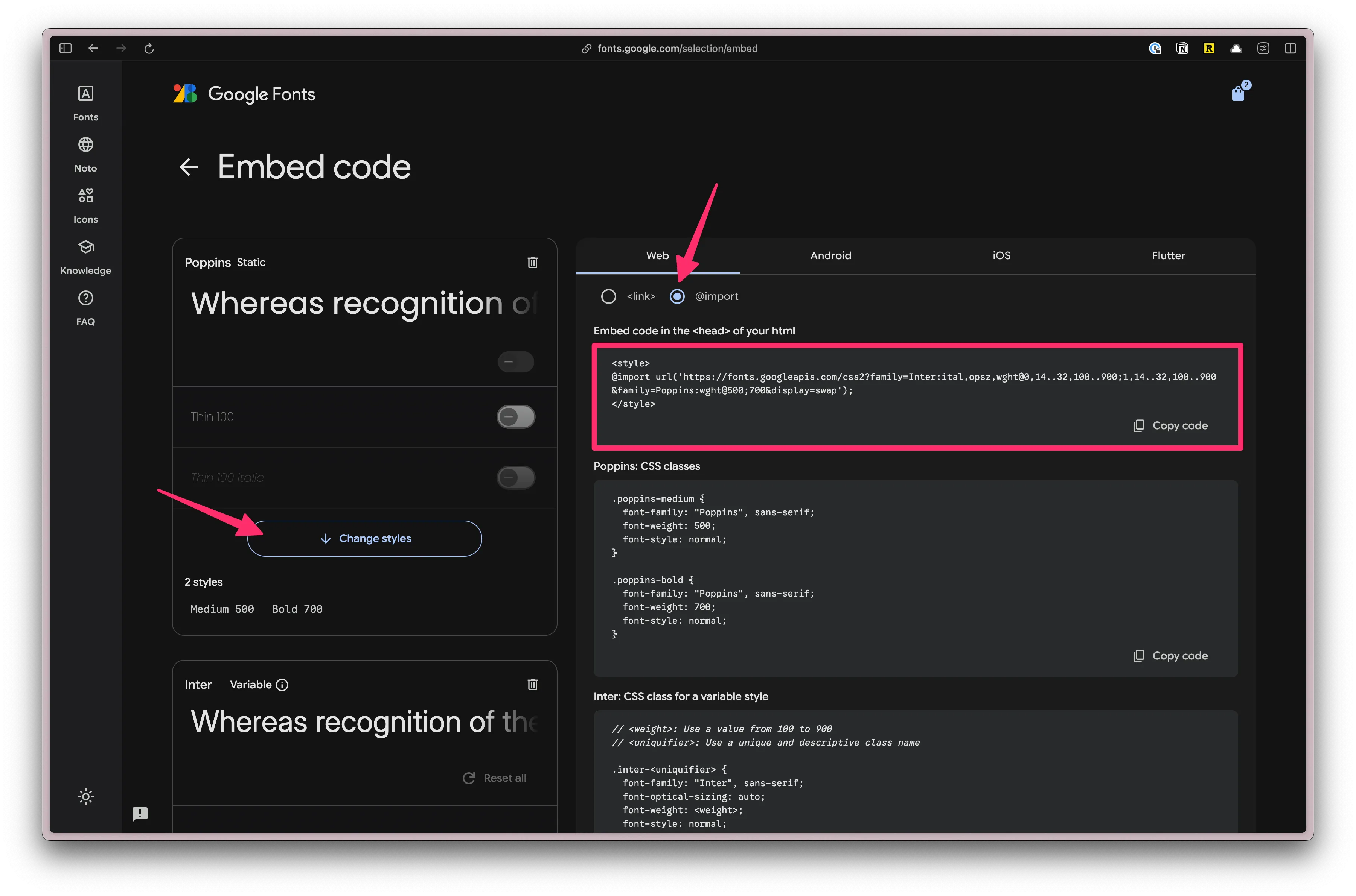
Next, let’s only select the font weights that we’ll need for our project.
Under Poppins, click on the “Change Styles” button. Turn everything off except for “500” and “700”.
Under Inter, if you click on the “Change Styles” button, you’ll see the settings are slightly different. That’s because this is variable font. A variable font is a single font file that contains multiple variations of a typeface, allowing for dynamic manipulation of the font. Meaning, nothing to do here.
Next, select the @import radio button and copy the code.
Paste the code at the top of our styles.css file. Then, remove the <style> tags:
@import url('https://fonts.googleapis.com/css2?family=Inter:ital,opsz,wght@0,14..32,100..900;1,14..32,100..900&family=Poppins:wght@500;700&display=swap');
@import "tailwindcss";Next, we need to add a custom configuration. In TailwindCSS v4, all customizations happen in the CSS file, not tailwind.config.js.
Below the @import "tailwindcss"; line, add the following:
@theme { --font-display: "Poppins", sans-serif; --font-body: "Inter", sans-serif;}If you’re unsure how the font-family is written, you can find it in the CSS class definition on the Google Fonts page. Here, Poppins and Inter are both in quotes and capitalized: "Poppins" and "Inter".
Now, you can use the classes font-display and font-body in your project.
Before this will work in production, we need to update our security headers to allow googleapis and fonts.gstatic:
26 collapsed lines
import { RouteMiddleware } from "rwsdk/router";
export const setCommonHeaders =(): RouteMiddleware =>({ response, rw: { nonce } }) => { if (!import.meta.env.VITE_IS_DEV_SERVER) { // Forces browsers to always use HTTPS for a specified time period (2 years) response.headers.set( "Strict-Transport-Security", "max-age=63072000; includeSubDomains; preload" ); }
// Forces browser to use the declared content-type instead of trying to guess/sniff it response.headers.set("X-Content-Type-Options", "nosniff");
// Stops browsers from sending the referring webpage URL in HTTP headers response.headers.set("Referrer-Policy", "no-referrer");
// Explicitly disables access to specific browser features/APIs response.headers.set( "Permissions-Policy", "geolocation=(), microphone=(), camera=()" );
// Defines trusted sources for content loading and script execution: response.headers.set( "Content-Security-Policy", `default-src 'self'; script-src 'self' 'nonce-${nonce}' https://challenges.cloudflare.com; style-src 'self' 'unsafe-inline' https://fonts.googleapis.com; font-src 'self' https://fonts.gstatic.com; frame-src https://challenges.cloudflare.com; object-src 'none';` );};Setting up our Custom Color Palette
Section titled “Setting up our Custom Color Palette”Defining colors is similar, except we’ll prepend each color value with --color-.
@theme {  ...  --color-bg: #e4e3d4;  --color-border: #eeeef0;
  --color-primary: #f7b736;  --color-secondary: #f1f1e8;  --color-destructive: #ef533f;
  --color-tag-applied: #b1c7c0;  --color-tag-interview: #da9b7c;  --color-tag-new: #db9a9f;  --color-tag-rejected: #e4e3d4;  --color-tag-offer: #aae198;}
We're using three different groups of colors:
- semantically named colors: background and border
- buttons: primary, secondary, and destructive
- tag colors: applied, interview, new, rejected, and offer
Now, we can use these colors for backgrounds (bg-bg), borders (border-border), and text (text-destructive).
Let’s test to make sure our custom colors are working. On the Login.tsx file, let’s change the React fragment <></> to a <main> tag and add a className of bg-bg:
... return ( <main className="bg-bg">14 collapsed lines
<h1 className="text-4xl font-bold text-red-500">YOLO</h1> <input type="text" value={username} onChange={(e) => setUsername(e.target.value)} placeholder="Username" /> <Button onClick={handlePerformPasskeyLogin} disabled={isPending}> {isPending ? <>...</> : "Login with passkey"} </Button> <Button onClick={handlePerformPasskeyRegister} disabled={isPending}> {isPending ? <>...</> : "Register with passkey"} </Button> {result && <div>{result}</div>} </main> );}When you visit http://localhost:5173/user/login, you should see a beige background color:
shadcn/ui UI Components
Section titled “shadcn/ui UI Components”Now, let’s install shadcn/ui. You can also use the shadcn/ui Vite Installation instructions or follow along here:
-
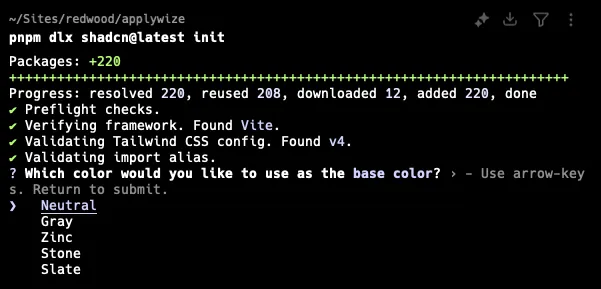
Install shadcn/ui
Terminal window npx shadcn@latest initTerminal window pnpx shadcn@latest initTerminal window yarn dlx shadcn@latest initIt will ask you what theme you want to use. Let’s go with Neutral.
This command will create a
components.jsonfile in the root of your project. It contains all the configuration for our shadcn/ui components.Let’s modify the default paths so that it will put our components in the
src/app/components/uifolder.components.json ..."aliases": {"components": "@/app/components","utils": "@/app/lib/utils","ui": "@/app/components/ui","lib": "@/app/lib","hooks": "@/app/hooks"}, -
Now, you should be able to add shadcn/ui components:
Terminal window npx shadcn@latest addTerminal window pnpx shadcn@latest addTerminal window yarn dlx shadcn@latest addSelect the following by hitting the
Spacekey:- Alert
- Avatar
- Badge
- Breadcrumb
- Button
- Calendar
- Dialog
- Popover
- Select
- Sheet
- Sonner
- Table
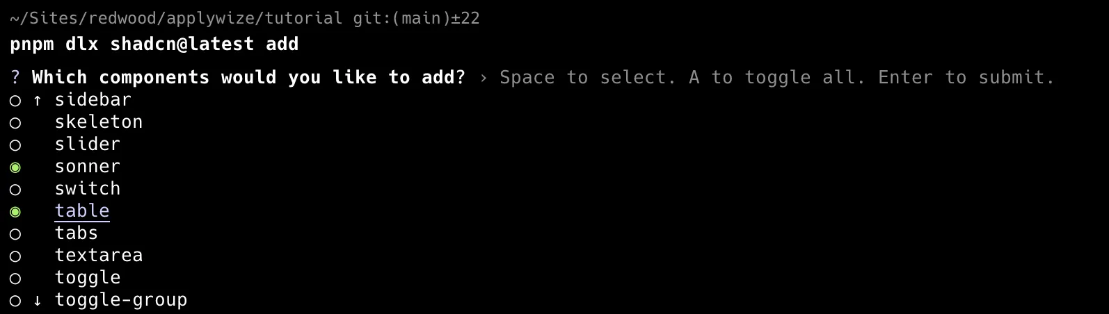
When you’ve selected all the components you want to add, hit
Enter. This will add all the components inside thesrc/app/components/uifolder.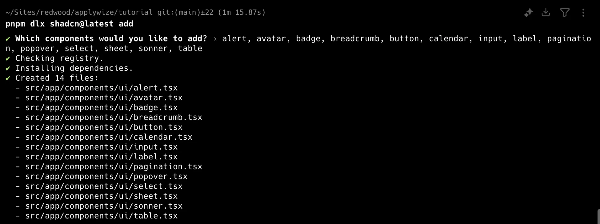
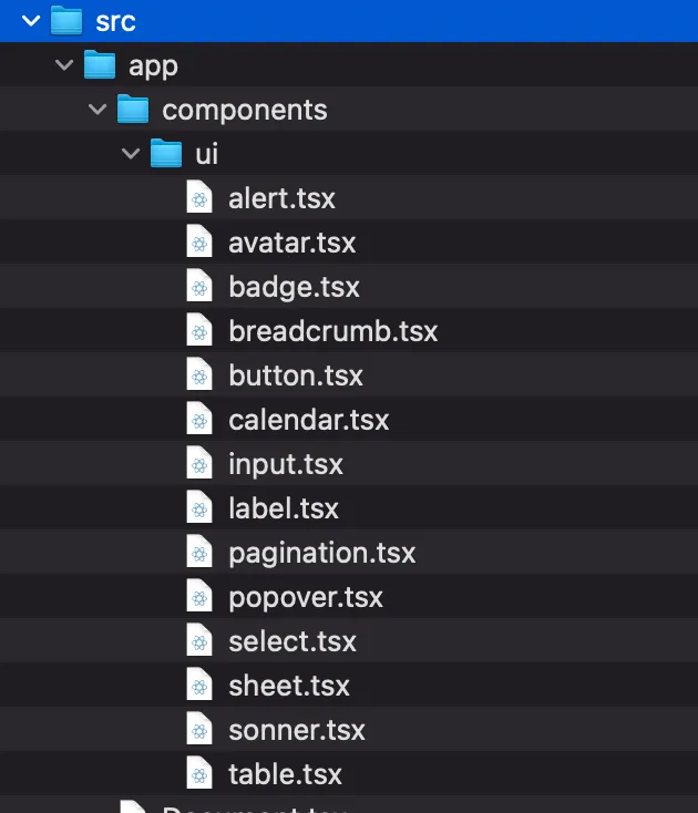
Even though we specified the path to the lib directory in the components.json file, the script still placed the folder inside the src directory. You’ll need to move it into the app directory.
Directorysrc/
Directoryapp/
Directorycomponents/
Directoryui/
- …
Directorylib/
- utils.ts
We also need the date picker component, but it’s not available to install using the pnpm dlx shadcn@latest add command, probably due to dependencies.
Instead, we’ll install it manually. It’s built on top of the <Popover /> and <Calendar /> components — and we just installed those.
Within the src/app/components/ui folder, create a new file called datepicker.tsx.
Add the following code to the datepicker.tsx file:
"use client"
import * as React from "react"import { format } from "date-fns"import { Calendar as CalendarIcon } from "lucide-react"
import { cn } from "@/app/lib/utils"import { Button } from "@/app/components/ui/button"import { Calendar } from "@/app/components/ui/calendar"import { Popover, PopoverContent, PopoverTrigger,} from "@/app/components/ui/popover"
export function DatePicker() { const [date, setDate] = React.useState<Date>()
return ( <Popover> <PopoverTrigger asChild> <Button variant={"outline"} className={cn( "w-[280px] justify-start text-left font-normal", !date && "text-muted-foreground" )} > <CalendarIcon className="mr-2 h-4 w-4" /> {date ? format(date, "PPP") : <span>Pick a date</span>} </Button> </PopoverTrigger> <PopoverContent className="w-auto p-0"> <Calendar mode="single" selected={date} onSelect={setDate} initialFocus /> </PopoverContent> </Popover> )}- Official Date Picker documentation.
- If you copy and paste directly from the shadcn/ui documentation, though, you’ll find a few path errors. In the code I provided, I adjusted the paths on some of the
@importstatements.
import { cn } from "@/lib/utils"import { cn } from "@/app/lib/utils"import { Button } from "@/components/ui/button"import { Button } from "@/app/components/ui/button"import { Calendar } from "@/components/ui/calendar"import { Calendar } from "@/app/components/ui/calendar"import { Popover, PopoverContent, PopoverTrigger,} from "@/components/ui/popover"import { Popover, PopoverContent, PopoverTrigger,} from "@/app/components/ui/popover"- I also changed the component name to
DatePicker:
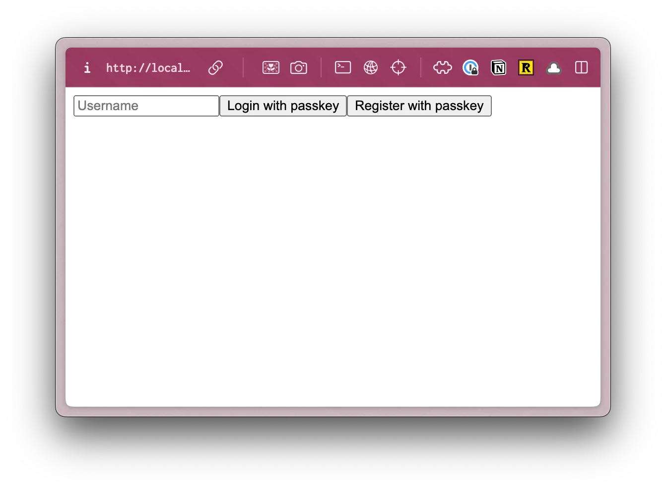
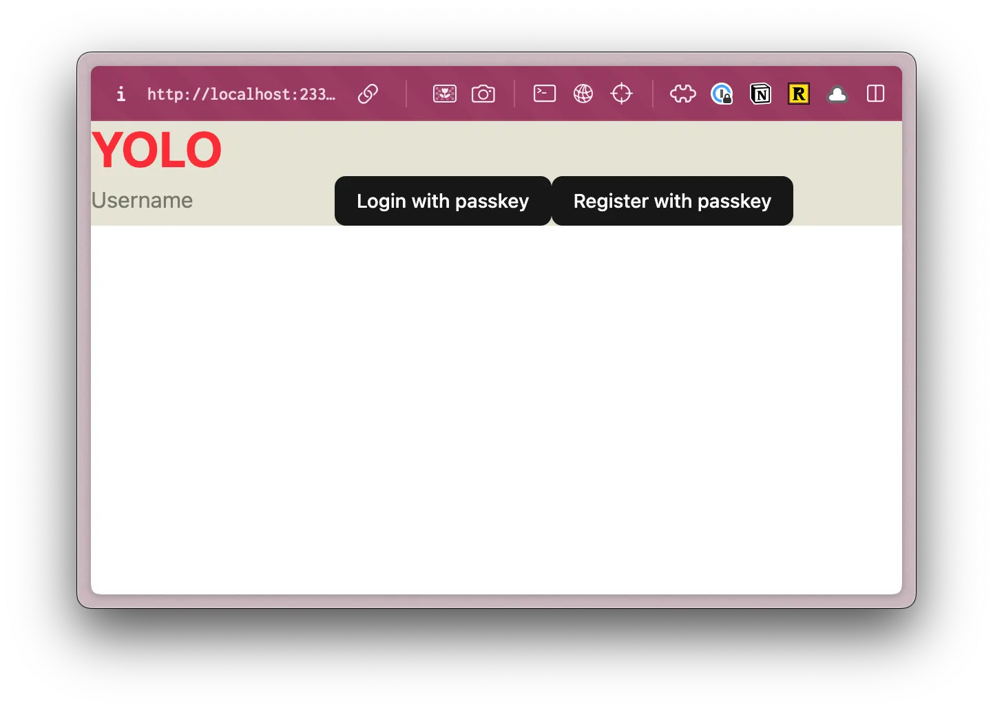
export function DatePickerDemo() {export function DatePicker() {If you want to make sure everything is installed correctly, head over to the src/app/pages/user/Login.tsx file and let’s use our shadcn/ui Button component.
Change the <button> tag to use a capital B. This will reference the Button component, instead of the standard HTML button. You’ll also need to import the Button component at the top of the file.
import { Button } from "@/app/components/ui/button";...return ( <>7 collapsed lines
<h1 className="text-4xl font-bold text-red-500">YOLO</h1> <input type="text" value={username} onChange={(e) => setUsername(e.target.value)} placeholder="Username" /> <Button onClick={handlePerformPasskeyLogin} disabled={isPending}> {isPending ? <>...</> : "Login with passkey"} </Button> <Button onClick={handlePerformPasskeyRegister} disabled={isPending}> {isPending ? <>...</> : "Register with passkey"} </Button> {result && <div>{result}</div>} </>);Now, when you visit http://localhost:5173/user/login, you should see styled buttons:
Perfect, now that we have our project setup, and all the frontend components installed, let’s start building the backend.