Authentication
Our authentication has three main parts:
- Sessions (remembers you’re logged in)
- Protected routes (pages that need login/authentication)
- Login / Sign up forms (how you sign in)
Since we’re using the standard starter kit, it already has passkey authentication set up.
How it Works:
- A user creates a passkey during the registration process.
- A unique public-private key pair is generated.
- The private key remains securely stored on the user’s device or in a password manager.
- The public key is shared with the service.
- When the user logs in, they have to “prove” they have access to the private key.
- The service verifies the user’s identity using the public key.
Think of it like a mailbox system: You give the website a special mailbox (the public key), that only your unique key can open. When you want to log in, the website puts a secret message in your mailbox. Only you have the key to open it and read the message, which proves you’re the real account owner.
Let’s start by taking a look at the worker.tsx file. This file sets up our Cloudflare worker, but it also handles all the routing, middleware, and interrupters.
12 collapsed lines
import { defineApp, ErrorResponse } from "rwsdk/worker";import { route, render, prefix } from "rwsdk/router";import { Document } from "@/app/Document";import { Home } from "@/app/pages/Home";import { setCommonHeaders } from "@/app/headers";import { userRoutes } from "@/app/pages/user/routes";import { sessions, setupSessionStore } from "./session/store";import { Session } from "./session/durableObject";import { type User, db, setupDb } from "@/db";import { env } from "cloudflare:workers";export { SessionDurableObject } from "./session/durableObject";
export type AppContext = { session: Session | null; user: User | null;};
export default defineApp([ setCommonHeaders(), async ({ ctx, request, headers }) => { await setupDb(env); setupSessionStore(env);
try { ctx.session = await sessions.load(request); } catch (error) { if (error instanceof ErrorResponse && error.code === 401) { await sessions.remove(request, headers); headers.set("Location", "/user/login");
return new Response(null, { status: 302, headers, }); }
throw error; }
if (ctx.session?.userId) { ctx.user = await db.user.findUnique({ where: { id: ctx.session.userId, }, }); } }, render(Document, [ route("/", () => new Response("Hello, World!")), route("/protected", [ ({ ctx }) => { if (!ctx.user) { return new Response(null, { status: 302, headers: { Location: "/user/login" }, }); } }, Home, ]), prefix("/user", userRoutes), ]),]);This is a large chunk of code, so let’s break it down, chunk by chunk:
export type AppContext = { session: Session | null; user: User | null;};- On lines 13-16, we’re setting up the types for our application’s context object. Specifically, we’re defining the
sessionanduserproperties.- The
Sessiontype is defined insrc/session/durableObject.ts. (Imported on line 8.) It contains auserId,challenge, andcreatedAt. - The
Usertype comes from our@generated/prisma. (Imported on line 9.)
- The
setCommonHeaders(),- On line 19 we’re setting up our common headers. This is a function inside of
app/src/headers.ts. (Imported on line 5.) It creates the Security Policies, Transport Policy, Referrer Policy, and Permissions Policy. You can find additional documentation here.
async ({ ctx, request, headers }) => { await setupDb(env); setupSessionStore(env);
try { ctx.session = await sessions.load(request); } catch (error) { if (error instanceof ErrorResponse && error.code === 401) { await sessions.remove(request, headers); headers.set("Location", "/user/login");
return new Response(null, { status: 302, headers, }); }
throw error; }
if (ctx.session?.userId) { ctx.user = await db.user.findUnique({ where: { id: ctx.session.userId, }, }); }},- On lines 20-47, we’re setting up our middleware. This will run between every request and response cycle.
- First, we’re setting up the database
setupDb(env);We’ll use this later, on line 42-44, to find the logged in user. - Then, we’re setting up the session store
setupSessionStore(env);. We’re using Cloudflare’s Durable Objects to store our session data and loading it.sessions.load(request) - On lines 26-35, we’re catching unauthorized errors. If there’s an error and the status code is 401, we remove the session and redirect the user to the login page.
- On lines 40-46, we check the
ctxfor thesessionobject. If it has auserId, we connect to the database and get all the user data. The result gets saved into thectx.userobject.
- First, we’re setting up the database
render(Document, [- On line 48, we’re setting up our document. This document is referencing our
src/app/Document.tsxfile. It contains ourhtml,head, andbodytags and wraps all of our pages.- One of the powerful yet simple features of RedwoodSDK is that it supports per-route documents. Read more about this on our blog.
render(Document, [ route("/", () => new Response("Hello, World!")),- On line 49, we’re setting up our home page route. Here, we’re just returning a standard response.
The router highlights the request-response lifecycle. The first parameter is the route we’re requesting and the second parameter is the response. This can be a standard response, or it can be a React component. On line 49, we’re returning a standard response that says Hello World!.
We can change that to return the Home page component by changing the second parameter:
route("/", Home),We can also change the home page route to use the index method:
import { index, route, render, prefix } from "rwsdk/router";...render(Document, [ index([Home]);...The index method is similar to the route method, but instead of taking two parameters, it only takes one, the response.
If we move further down our render method, the next route is a protected route at /protected.
route("/protected", [ ({ ctx }) => { if (!ctx.user) { return new Response(null, { status: 302, headers: { Location: "/user/login" }, }); } }, Home,]),Here, we’re using an interrupter to see if the user is logged in. This is a function that takes our ctx object and checks to see if the user object exists on it. If it doesn’t, we redirect the user to the login page (lines 53-56). Otherwise, we return the Home component (line 59).
prefix("/user", userRoutes),- On line 61, we’re prefixing all of our auth routes with
/user. Meaning, ourloginroute will be/user/loginand ourlogoutroute will be/user/logout.loginandlogoutare defined within theuserRoutesfile, imported on line 6. One of the cool things about the RedwoodSDK router is that the response parameter can be an array. This means we can define our route information in a separate file and then import it into ourworker.tsxfile.
We’re co-locating the file that defines our auth routes with our auth pages.
Let’s take a look at userRoutes. This is coming from src/app/pages/user/routes.ts.
import { route } from "rwsdk/router";import { Login } from "./Login";import { sessions } from "@/session/store";
export const userRoutes = [ route("/login", [Login]), route("/logout", async function ({ request }) { const headers = new Headers(); await sessions.remove(request, headers); headers.set("Location", "/");
return new Response(null, { status: 302, headers, }); }),];We’re defining 2 routes:
/login- This is displaying our login page (on line 6)./logout- This is our logout route (on line 7), but instead of returning JSX, we’re removing the session (line 9) and redirecting the user to the home page (line 10). Then, we return the response (line 12-15). The 302 status code means we’re redirecting to theLocationheader.
Setting up the Signup Page
Section titled “Setting up the Signup Page”Let’s create a third route for registering a new user, giving sign up a dedicated page.
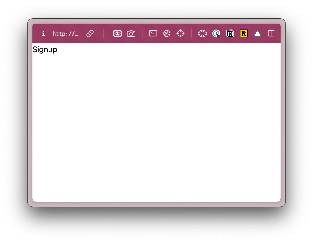
Inside, our src/app/pages/user directory, create a new file called Signup.tsx. Let’s stub out a simple function, just to make sure it’s working:
export const Signup = () => { return <div>Signup</div>;}Now, we need to add this route to our userRoutes array (inside of src/app/pages/user/routes.ts):
import { route } from "rwsdk/router";import { Login } from "./Login";import { Signup } from "./Signup";import { sessions } from "@/session/store";
export const userRoutes = [ route("/login", [Login]), route("/signup", [Signup]), route("/logout", async function ({ request }) { const headers = new Headers(); await sessions.remove(request, headers); headers.set("Location", "/");
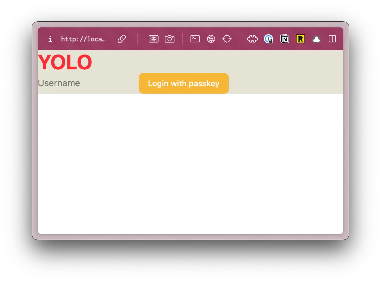
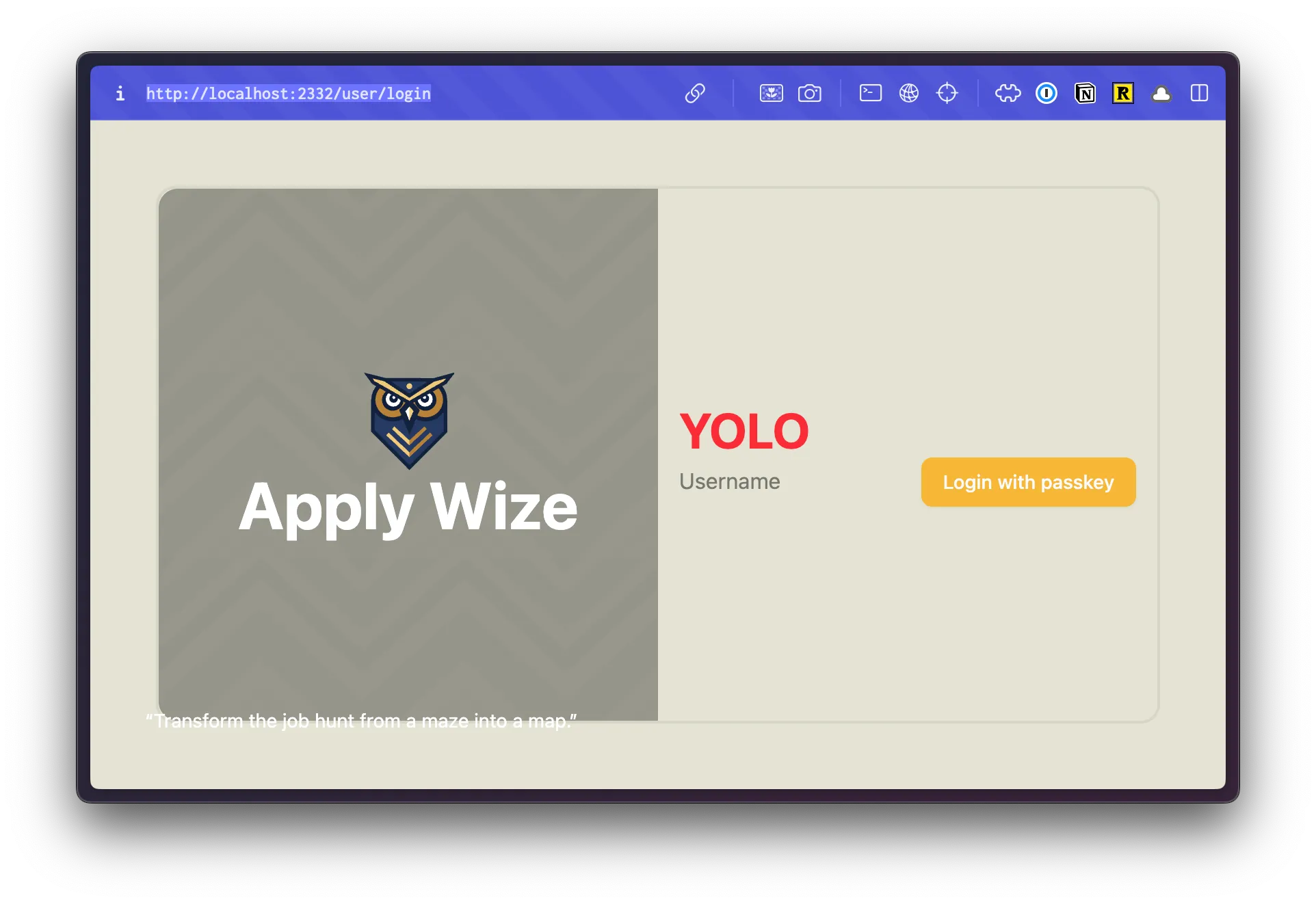
return new Response(null, { status: 302, headers, }); }),];Within our browser, let’s go to http://localhost:5173/user/signup and you should see:
Now, let’s move over some of the functionality from our Login.tsx to our Signup.tsx. But first, let’s make sure we understand what’s happening in our Login.tsx.
Let’s break it down, chunk by chunk:
"use client";- On line 1, we have a
use clientdirective. By default, all components within RedwoodSDK are server components. Here, we're explicitly telling React to render this component on the client side (in the browser). Anytime you want there to be interactivity (clicking on buttons or managing state), you'll need to use a client component.
const [username, setUsername] = useState("");const [result, setResult] = useState("");- We're setting a couple pieces of state.
usernameis tied to our username input value.resultcontains our result message.
const [isPending, startTransition] = useTransition();- We're using React's
useTransitionhook to manage our loading state. (More on this later, but you can also find more within the official React documentation.)
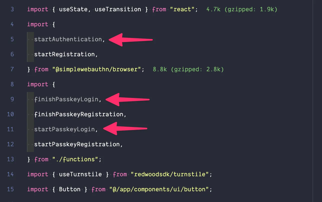
const passkeyLogin = async () => { // 1. Get a challenge from the worker const options = await startPasskeyLogin();
// 2. Ask the browser to sign the challenge const login = await startAuthentication({ optionsJSON: options });
// 3. Give the signed challenge to the worker to finish the login process const success = await finishPasskeyLogin(login);
if (!success) { setResult("Login failed"); } else { setResult("Login successful!"); }};- On line 21, we're defining our
passkeyLoginfunction. - The functions
startPasskeyLogin,startAuthentication, andfinishPasskeyLoginare all defined in thesrc/app/pages/user/functions.tsfile. You can find more information about these functions in the Authentication docs. - We start the Passkey login authentication
startPasskeyLogin(), and then determine whether it was successful or not. - If it wasn't successful, we set the result message to "Login failed".
- Otherwise, we set the result message to "Login successful!".
const passkeyRegister = async () => { // 1. Get a challenge from the worker const options = await startPasskeyRegistration(username);
// 2. Ask the browser to sign the challenge const registration = await startRegistration({ optionsJSON: options });
// 3. Give the signed challenge to the worker to finish the registration process const success = await finishPasskeyRegistration(username, registration);
if (!success) { setResult("Registration failed"); } else { setResult("Registration successful!"); } };- Here, we're defining our
passkeyRegisterfunction. This is similar thepasskeyLoginfunction, but this handles the registration process.- The functions
startPasskeyRegistration,startRegistration, andfinishPasskeyRegistrationare all defined in thesrc/app/pages/user/functions.tsfile. You can find more information about these functions in the Passkey Authentication docs. - If the registration isn't successful, we set the result message to "Registration failed".
- Otherwise, we set the result message to "Registration successful!".
- The functions
const handlePerformPasskeyLogin = () => { startTransition(() => void passkeyLogin());};- The
handlePerformPasskeyLoginfunction handles the transition and calls thepasskeyLoginfunction.
const handlePerformPasskeyRegister = () => { startTransition(() => void passkeyRegister());};- The
handlePerformPasskeyRegisterfunction handles the transition and calls thepasskeyRegisterfunction.
Now, moving down to our return statement, inside:
<input type="text" value={username} onChange={(e) => setUsername(e.target.value)} placeholder="Username"/>- We're rendering an input field. This is tied to our
usernameuseState(line 17).
<Button onClick={handlePerformPasskeyLogin} disabled={isPending}> {isPending ? <>...</> : "Login with passkey"}</Button><Button onClick={handlePerformPasskeyRegister} disabled={isPending}> {isPending ? <>...</> : "Register with passkey"}</Button>- We're rendering two buttons. These buttons are tied to our
handlePerformPasskeyLoginandhandlePerformPasskeyRegisterfunctions.
{result && <div>{result}</div>}- We're rendering the result message.
Let’s start by copying all the contents from our Login.tsx and pasting it into our Signup.tsx. Be sure that the component is still named Signup.
export function Signup() {Let’s remove all the pieces that aren’t related to registering.
- We don’t need the
passkeyLoginfunction (lines 21-36) - You can delete the
handlePerformPasskeyLoginfunction (originally lines 55-57) - Let’s also remove the “Login with passkey” button (originally lines 72-74)
Now, we need to clean up our unused imports. Within our IDE, these should be grayed out:
Cleaned up Signup.tsx code
"use client";
import { useState, useTransition } from "react";import { startRegistration } from "@simplewebauthn/browser";import { finishPasskeyRegistration, startPasskeyRegistration,} from "./functions";import { Button } from "@/app/components/ui/button";
export function Signup() { const [username, setUsername] = useState(""); const [result, setResult] = useState(""); const [isPending, startTransition] = useTransition();
const passkeyRegister = async () => { // 1. Get a challenge from the worker const options = await startPasskeyRegistration(username);
// 2. Ask the browser to sign the challenge const registration = await startRegistration({ optionsJSON: options });
// 3. Give the signed challenge to the worker to finish the registration process const success = await finishPasskeyRegistration(username, registration);
if (!success) { setResult("Registration failed"); } else { setResult("Registration successful!"); } };
const handlePerformPasskeyRegister = () => { startTransition(() => void passkeyRegister()); };
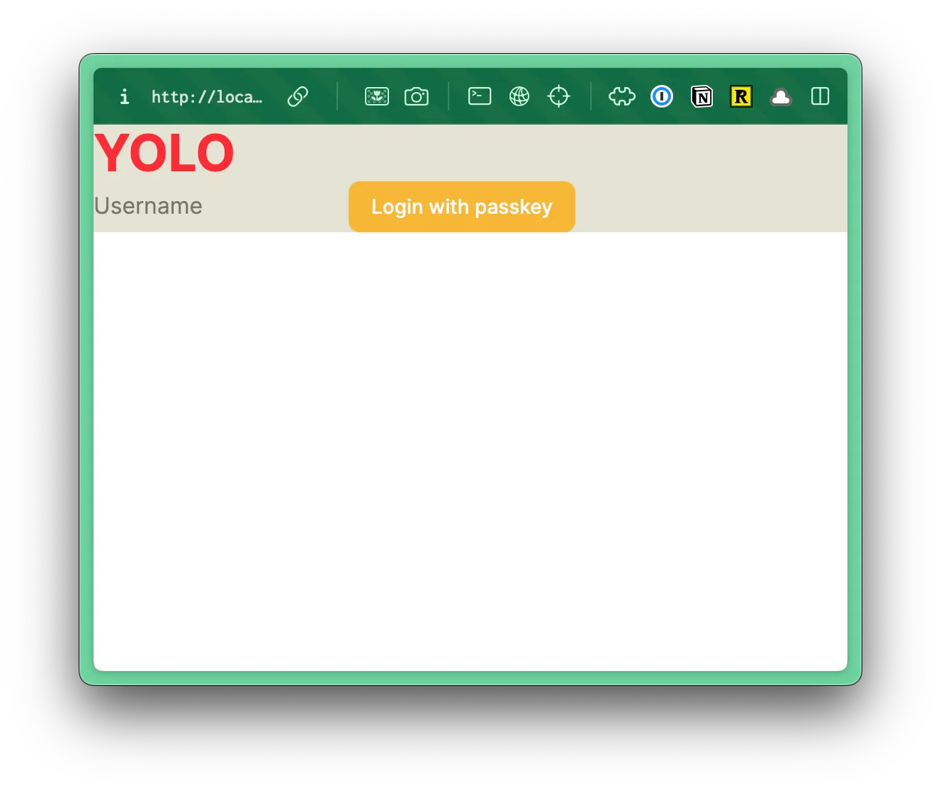
return ( <main className="bg-bg"> <h1 className="text-4xl font-bold text-red-500">YOLO</h1> <input type="text" value={username} onChange={(e) => setUsername(e.target.value)} placeholder="Username" /> <Button onClick={handlePerformPasskeyRegister} disabled={isPending}> {isPending ? <>...</> : "Register with passkey"} </Button> {result && <div>{result}</div>} </main> );}Now, let’s do the opposite for our Login.tsx.
- We can remove the
passkeyRegisterfunction (lines 38-53) - and the
handlePerformPasskeyRegisterfunction (originally lines 59-61) - We don’t need the
Register with passkeybutton (originally lines 75-77)
Don’t forget to clean up your unused imports, too.
Cleaned up Login.tsx code
"use client";
import { useState, useTransition } from "react";import { startAuthentication } from "@simplewebauthn/browser";import { finishPasskeyLogin, startPasskeyLogin } from "./functions";import { Button } from "@/app/components/ui/button";
export function Login() { const [username, setUsername] = useState(""); const [result, setResult] = useState(""); const [isPending, startTransition] = useTransition();
const passkeyLogin = async () => { // 1. Get a challenge from the worker const options = await startPasskeyLogin();
// 2. Ask the browser to sign the challenge const login = await startAuthentication({ optionsJSON: options });
// 3. Give the signed challenge to the worker to finish the login process const success = await finishPasskeyLogin(login);
if (!success) { setResult("Login failed"); } else { setResult("Login successful!"); } };
const handlePerformPasskeyLogin = () => { startTransition(() => void passkeyLogin()); };
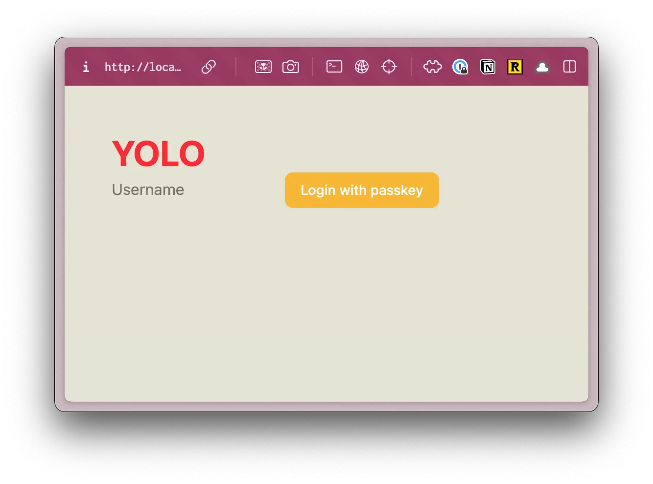
return ( <main className="bg-bg"> <h1 className="text-4xl font-bold text-red-500">YOLO</h1> <input type="text" value={username} onChange={(e) => setUsername(e.target.value)} placeholder="Username" /> <Button onClick={handlePerformPasskeyLogin} disabled={isPending}> {isPending ? <>...</> : "Login with passkey"} </Button> {result && <div>{result}</div>} </main> );}Now, let’s test our code:
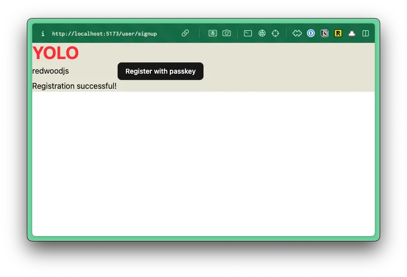
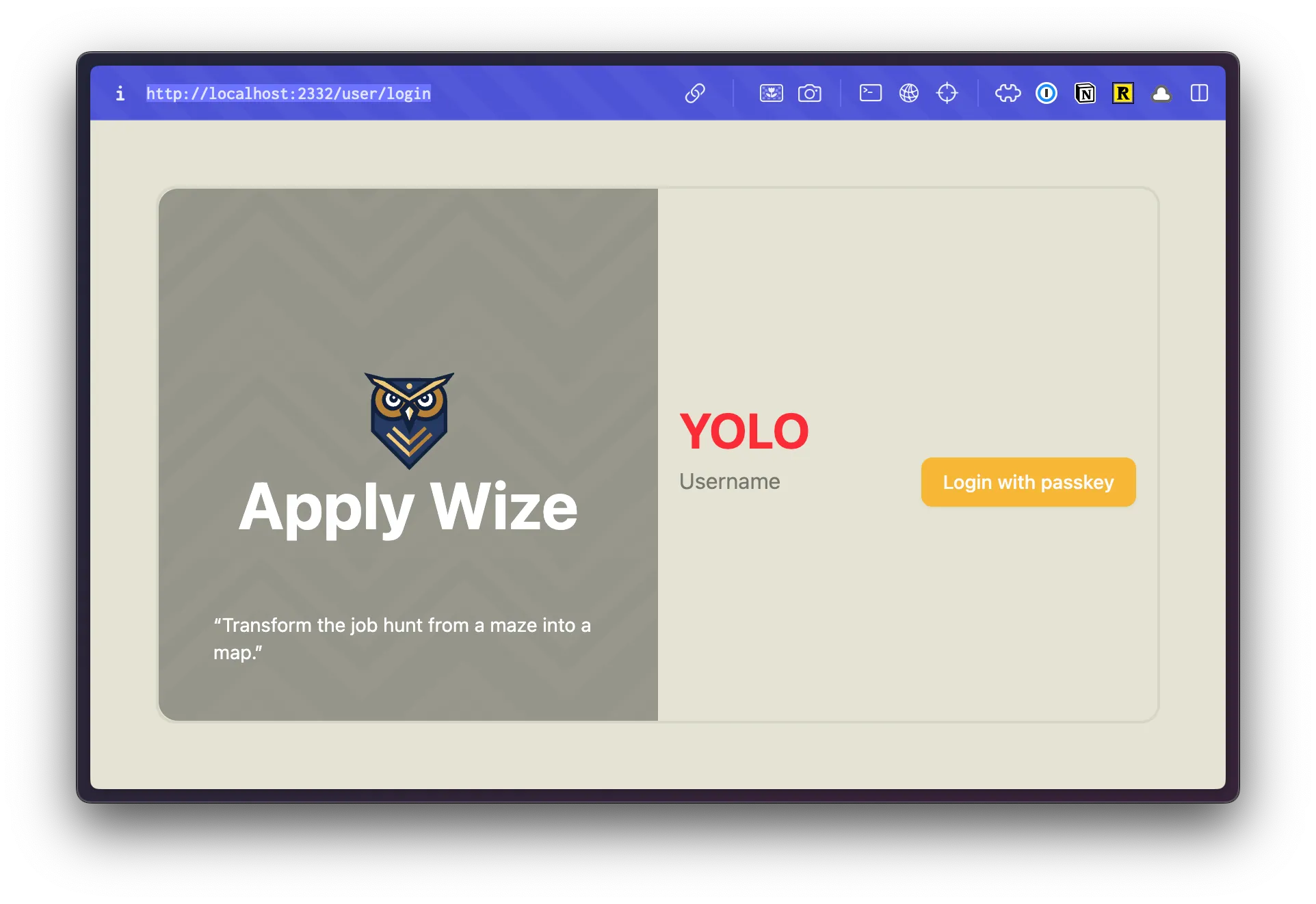
pnpm run devWithin the browser, go to http://localhost:5173/user/signup.
Add a username and click “Register with passkey”.
If you’re using a Password Manager, like 1Password, it’s easy to create and manage your passkeys. Of course, there are other tools to choose from. Apple even has their own native solution.
Once you’ve successfully logged in our result message displayed at the bottom of the form.
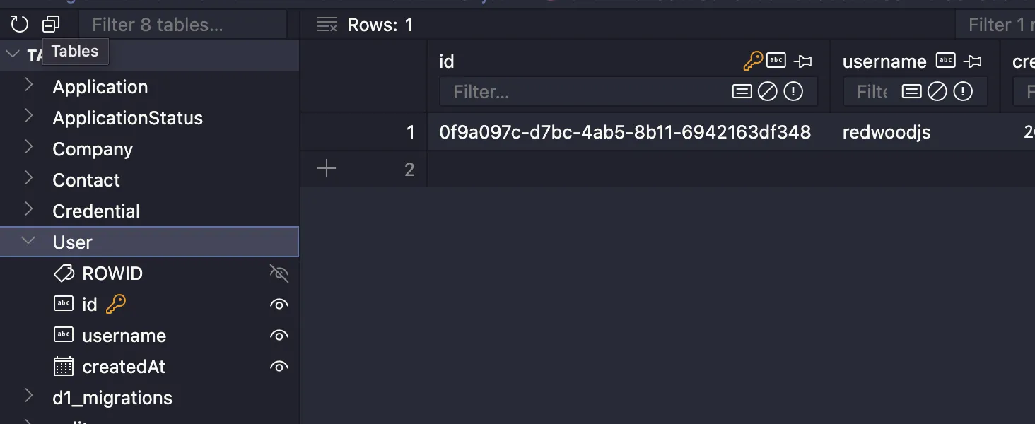
You should also be able to see the new user in the database:
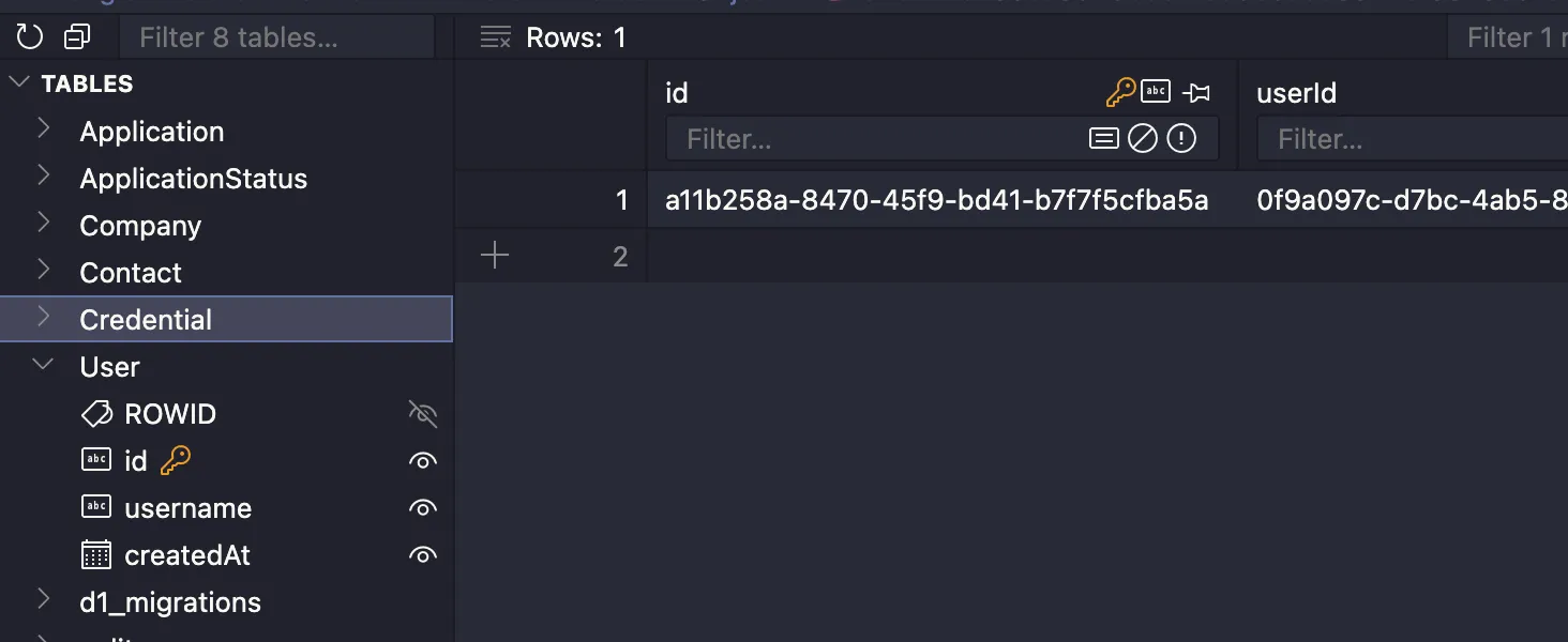
And the related entry in the Credential table:
Before we move on to the Login page, let’s adjust the success conditional. If the user is able to successfully register, we want to redirect them to the Login page:
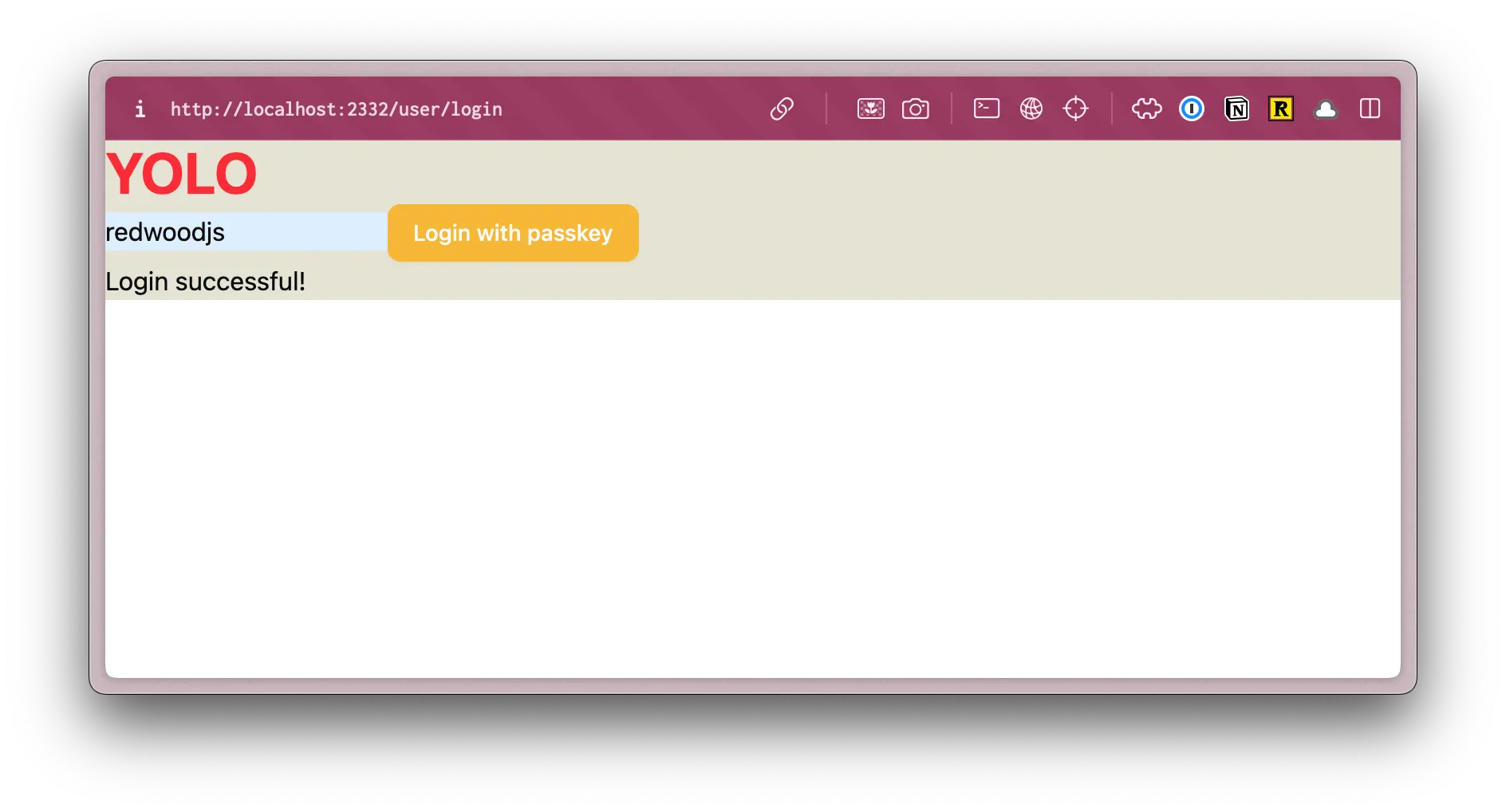
if (!success) { setResult("Registration failed");} else { window.location.href = "/user/login";}Now, let’s try logging in. Go to http://localhost:5173/user/login, enter your username and click on the Login with passkey button. Then, you should be prompted for the passkey.

Once you’ve successfully logged in, you should see a successful result message displayed below the form.
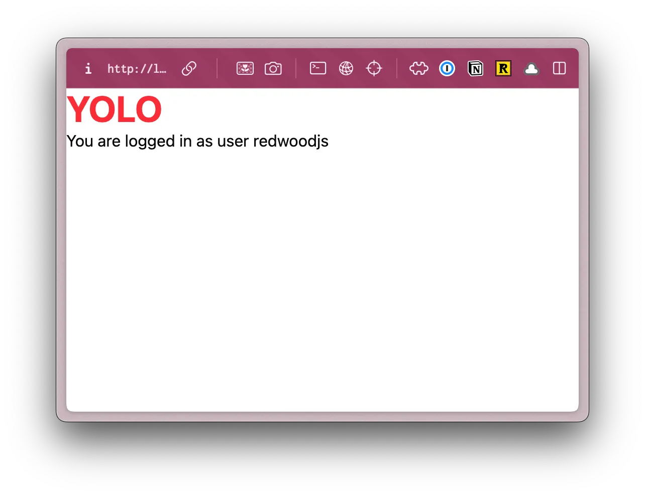
Now, navigate to http://localhost:5173/protected. You should see a message that you’re logged in as the user you just created.
Did you realize we haven’t been able to access the /protected route before because it was protected by an interrupter?
route("/protected", [ ({ ctx }) => { if (!ctx.user) { return new Response(null, { status: 302, headers: { Location: "/user/login" }, }); } }, Home,]),On line 52, we're checking to see if the user object exists on the ctx object. If it doesn't, we redirect the user to the /user/login page.
Try logging out, by going to http://localhost:5173/user/logout. You should be redirected to the login page.
Now, try going to the protected route again: http://localhost:5173/protected. You should be redirected to the login page.
Login and then you can visit the protected route again.
😎 Cool, right?
Styling the Login Page
Section titled “Styling the Login Page”Now that we know our authentication code is working, let’s add some styles and make it look good.
If we take a look at the final design within Figma, this is what we’re aiming for:

This is similar to the final sign up page. The only difference is the content on the right side.
Let’s create a layout component, that we can use in both places.
Creating a Layout Component
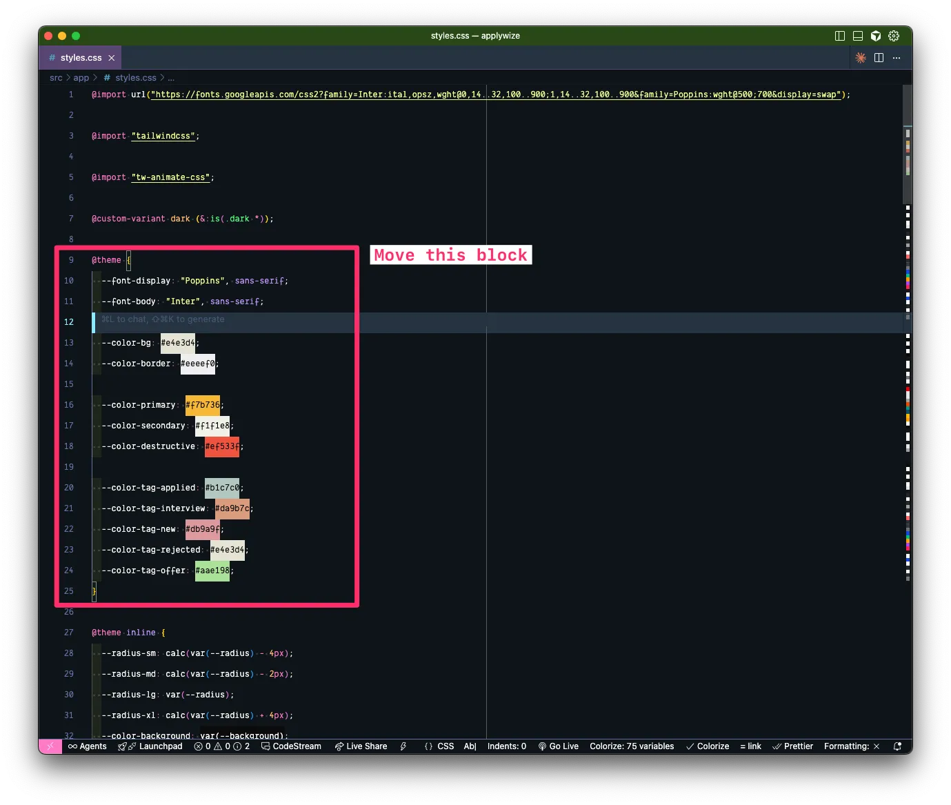
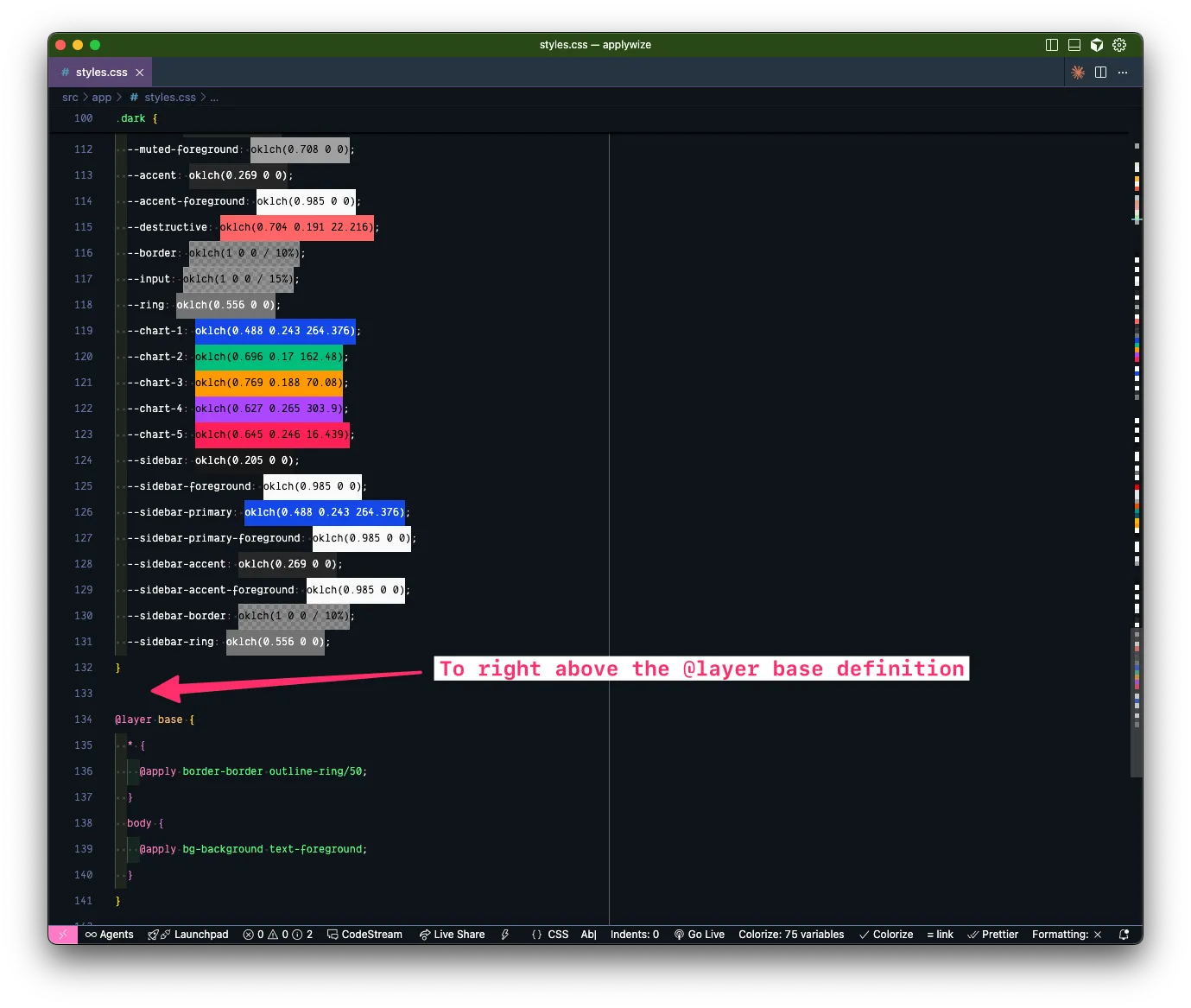
Section titled “Creating a Layout Component”When we installed shadcn/ui, it added a lot of variables to the bottom of our styles.css file. In CSS, order matters. So, let’s move our @theme definition to the bottom of the file, but above the @layer base definition so that it reads as more important and will override any shadcn/ui default values.
Updated styles.css file
@import url('https://fonts.googleapis.com/css2?family=Poppins:wght@500;700&display=swap');@import url('https://fonts.googleapis.com/css2?family=Inter:wght@400;700&display=swap');
@import "tailwindcss";
@import "tw-animate-css";
@custom-variant dark (&:is(.dark *));
body { font-family: var(--font-body);}
:root { --radius: 0.625rem; --background: oklch(1 0 0); --foreground: oklch(0.145 0 0); --card: oklch(1 0 0); --card-foreground: oklch(0.145 0 0); --popover: oklch(1 0 0); --popover-foreground: oklch(0.145 0 0); --primary: oklch(0.205 0 0); --primary-foreground: oklch(0.985 0 0); --secondary: oklch(0.97 0 0); --secondary-foreground: oklch(0.205 0 0); --muted: oklch(0.97 0 0); --muted-foreground: oklch(0.556 0 0); --accent: oklch(0.97 0 0); --accent-foreground: oklch(0.205 0 0); --destructive: oklch(0.577 0.245 27.325); --border: oklch(0.922 0 0); --input: oklch(0.922 0 0); --ring: oklch(0.708 0 0); --chart-1: oklch(0.646 0.222 41.116); --chart-2: oklch(0.6 0.118 184.704); --chart-3: oklch(0.398 0.07 227.392); --chart-4: oklch(0.828 0.189 84.429); --chart-5: oklch(0.769 0.188 70.08); --sidebar: oklch(0.985 0 0); --sidebar-foreground: oklch(0.145 0 0); --sidebar-primary: oklch(0.205 0 0); --sidebar-primary-foreground: oklch(0.985 0 0); --sidebar-accent: oklch(0.97 0 0); --sidebar-accent-foreground: oklch(0.205 0 0); --sidebar-border: oklch(0.922 0 0); --sidebar-ring: oklch(0.708 0 0);}
.dark { --background: oklch(0.145 0 0); --foreground: oklch(0.985 0 0); --card: oklch(0.205 0 0); --card-foreground: oklch(0.985 0 0); --popover: oklch(0.205 0 0); --popover-foreground: oklch(0.985 0 0); --primary: oklch(0.922 0 0); --primary-foreground: oklch(0.205 0 0); --secondary: oklch(0.269 0 0); --secondary-foreground: oklch(0.985 0 0); --muted: oklch(0.269 0 0); --muted-foreground: oklch(0.708 0 0); --accent: oklch(0.269 0 0); --accent-foreground: oklch(0.985 0 0); --destructive: oklch(0.704 0.191 22.216); --border: oklch(1 0 0 / 10%); --input: oklch(1 0 0 / 15%); --ring: oklch(0.556 0 0); --chart-1: oklch(0.488 0.243 264.376); --chart-2: oklch(0.696 0.17 162.48); --chart-3: oklch(0.769 0.188 70.08); --chart-4: oklch(0.627 0.265 303.9); --chart-5: oklch(0.645 0.246 16.439); --sidebar: oklch(0.205 0 0); --sidebar-foreground: oklch(0.985 0 0); --sidebar-primary: oklch(0.488 0.243 264.376); --sidebar-primary-foreground: oklch(0.985 0 0); --sidebar-accent: oklch(0.269 0 0); --sidebar-accent-foreground: oklch(0.985 0 0); --sidebar-border: oklch(1 0 0 / 10%); --sidebar-ring: oklch(0.556 0 0);}
@theme inline { --radius-sm: calc(var(--radius) - 4px); --radius-md: calc(var(--radius) - 2px); --radius-lg: var(--radius); --radius-xl: calc(var(--radius) + 4px); --color-background: var(--background); --color-foreground: var(--foreground); --color-card: var(--card); --color-card-foreground: var(--card-foreground); --color-popover: var(--popover); --color-popover-foreground: var(--popover-foreground); --color-primary: var(--primary); --color-primary-foreground: var(--primary-foreground); --color-secondary: var(--secondary); --color-secondary-foreground: var(--secondary-foreground); --color-muted: var(--muted); --color-muted-foreground: var(--muted-foreground); --color-accent: var(--accent); --color-accent-foreground: var(--accent-foreground); --color-destructive: var(--destructive); --color-border: var(--border); --color-input: var(--input); --color-ring: var(--ring); --color-chart-1: var(--chart-1); --color-chart-2: var(--chart-2); --color-chart-3: var(--chart-3); --color-chart-4: var(--chart-4); --color-chart-5: var(--chart-5); --color-sidebar: var(--sidebar); --color-sidebar-foreground: var(--sidebar-foreground); --color-sidebar-primary: var(--sidebar-primary); --color-sidebar-primary-foreground: var(--sidebar-primary-foreground); --color-sidebar-accent: var(--sidebar-accent); --color-sidebar-accent-foreground: var(--sidebar-accent-foreground); --color-sidebar-border: var(--sidebar-border); --color-sidebar-ring: var(--sidebar-ring);}
@theme { --font-display: "Poppins", sans-serif; --font-body: "Inter", sans-serif;
--color-bg: #e4e3d4; --color-border: #eeeef0;
--color-primary: #f7b736; --color-secondary: #f1f1e8; --color-destructive: #ef533f;
--color-tag-applied: #b1c7c0; --color-tag-interview: #da9b7c; --color-tag-new: #db9a9f; --color-tag-rejected: #e4e3d4; --color-tag-offer: #aae198;}
@layer base { * { @apply border-border outline-ring/50; } body { @apply bg-background text-foreground; }}If you take a look in the browser, by changing the position of the @theme block, it also changed the button’s background color to yellow, our primary color. Perfect.
RedwoodSDK supports layouts. This is perfect for creating shared UI layouts across multiple routes, allowing you to maintain consistent page structures and avoid code duplication.
Inside our app directory, create a new folder called layouts. Then, a new file called AuthLayout.tsx:
Directorysrc
Directoryapp
Directorylayouts
- AuthLayout.tsx
Let’s start by stubbing out our component:
import { type LayoutProps } from "rwsdk/router";
const AuthLayout = ({ children }: LayoutProps) => { return <div className="bg-bg min-h-screen min-w-screen p-12">{children}</div>;};
export { AuthLayout };Our layout component types are imported from rwsdk/router. This includes an object containing children and requestInfo. It's worth noting that the requestInfo object is only passed to server components (additional documentation).
On our wrapping div, I've added a few Tailwind styles.
bg-bguses the custom background color we set up previously.min-h-screenandmin-w-screenensures that the background color will take up the full screen.p-12adds48pxof padding around the entire screen.
As we continue to make adjustments, we want to be able to see the changes we’re making within the browser.
To wrap all our /user pages with the new AuthLayout component, let’s go back to our worker.tsx file.
At the top of our file, import the layout function from rwsdk/router:
import { route, render, prefix } from "rwsdk/router";import { route, render, prefix, layout } from "rwsdk/router";Now, let’s jump down to our prefix function:
prefix("/user", userRoutes),Wrap this code with the layout function we just imported:
layout(AuthLayout, [prefix("/user", userRoutes)]),The first parameter is the layout component we want to wrap our routes with. The second parameter is the routes we want to wrap.
We’ll also need to import the AuthLayout component we just referenced:
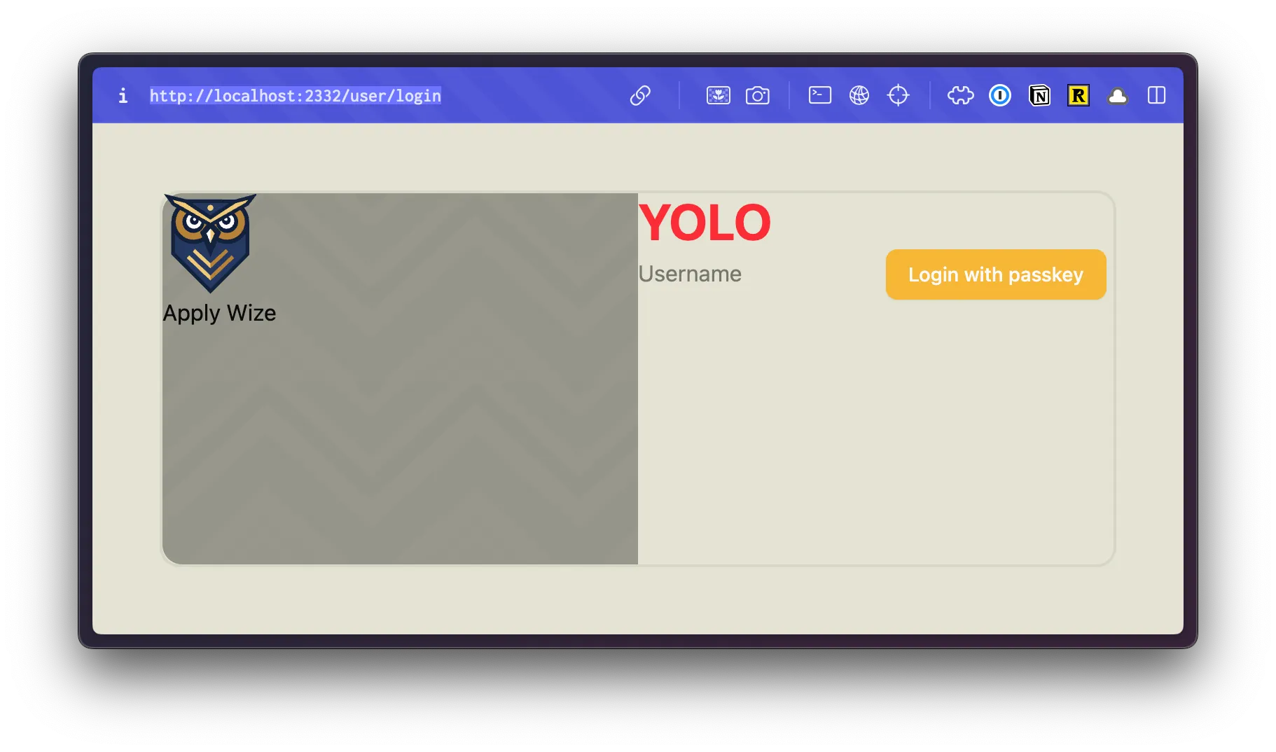
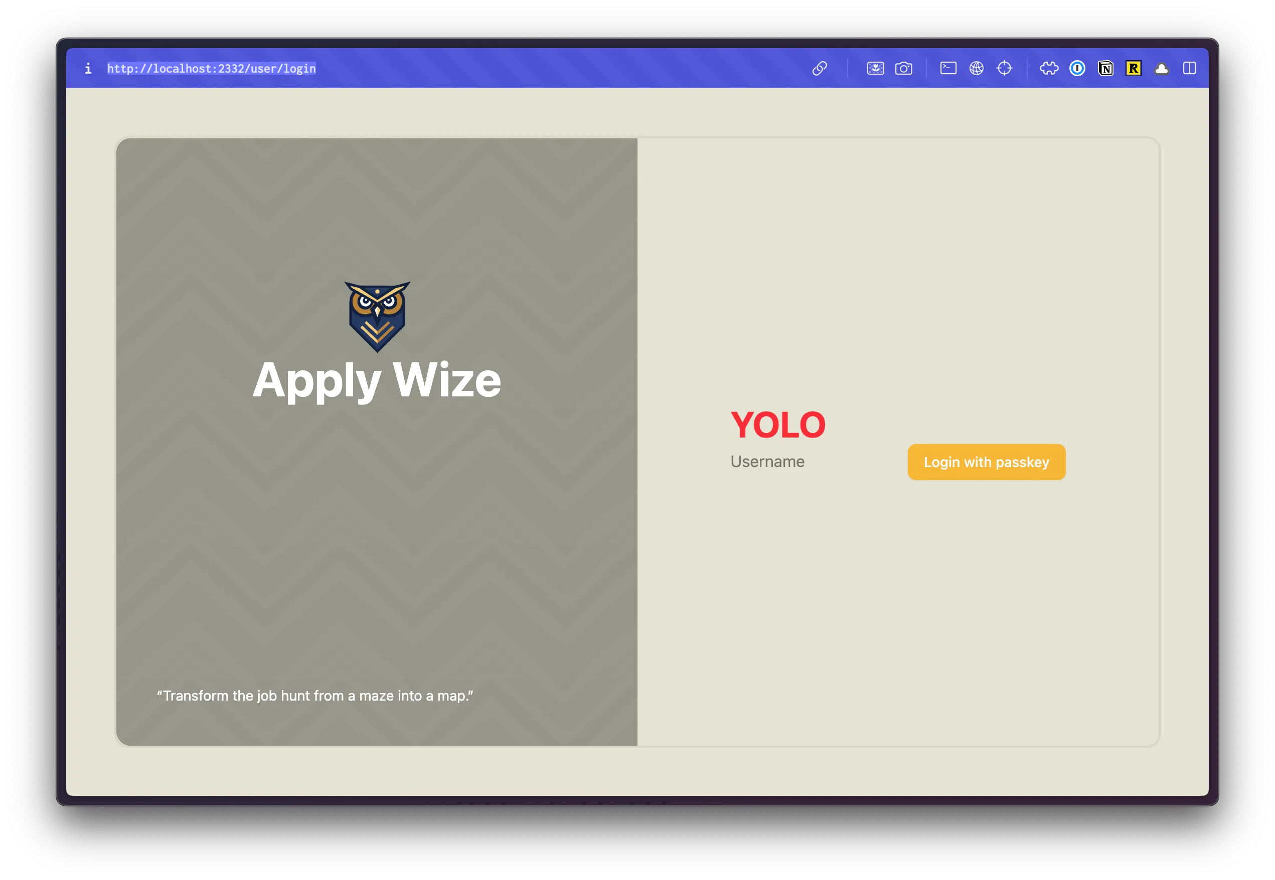
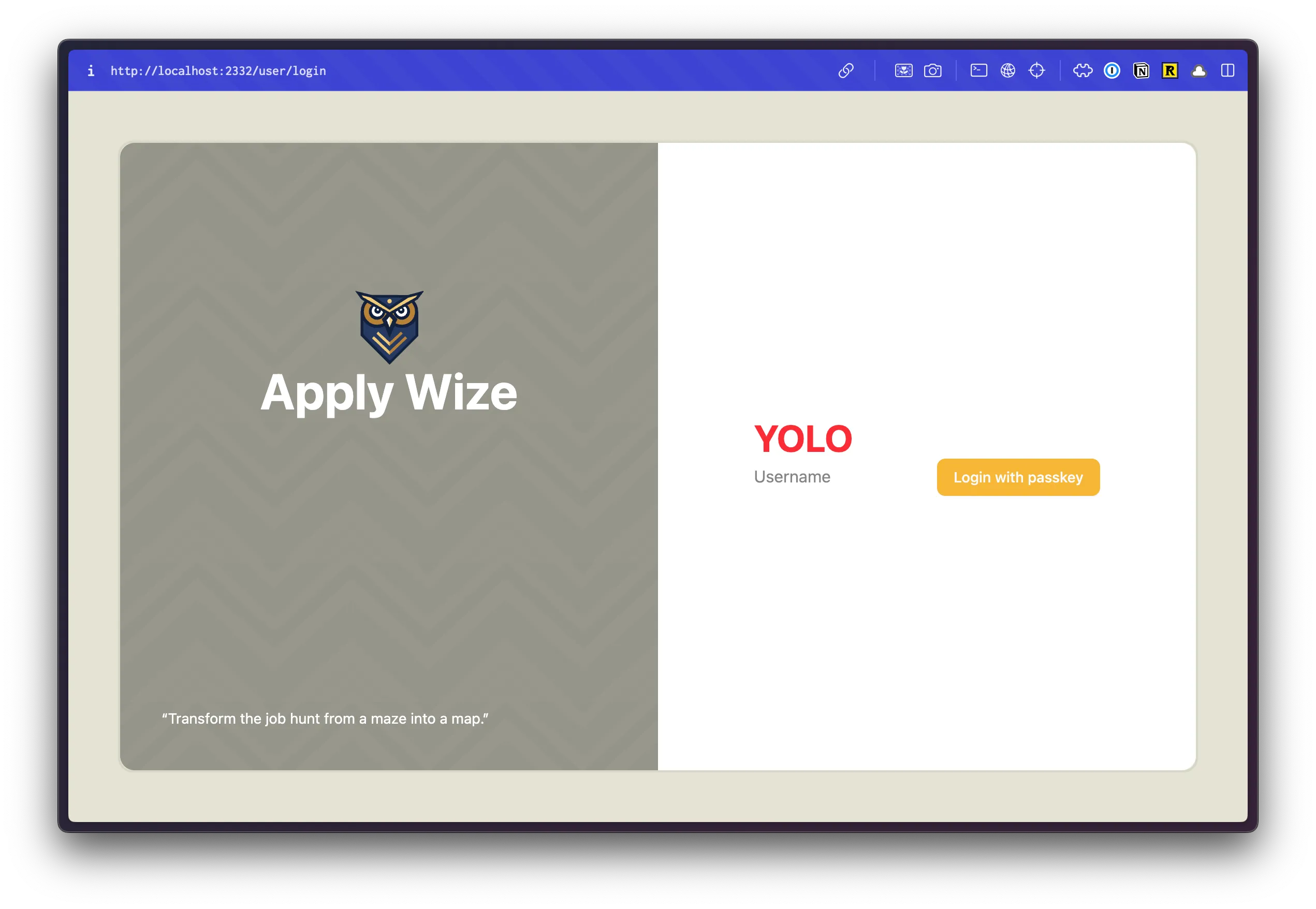
import { AuthLayout } from "@/app/layouts/AuthLayout";If we head over to the browser, we should see something like this:
For reference, this was before our AuthLayout component:
Sweet! Let’s keep going.
Inside our wrapping div, let’s set up our two column grid:
return ( <div className="bg-bg min-h-screen min-w-screen p-12"> <div className="grid grid-cols-2 min-h-[calc(100vh-96px)] rounded-xl border-2 border-[#D6D5C5]"> {children} </div> </div> );gridsets the display togrid, then we can specify that there are two columns withgrid-cols-2- We want the grid to take up the full height of the screen. If we use
min-h-screen, it will set the minimum height to100vh, but it will also introduce a scrollbar because we gave the wrappingdivpadding ofp-12. There's no way to know exactly what the height of the screen is, but we can have the browser calculate it for us withcalc(100vh-96px).p-12puts48pxof padding on the top and bottom or96pxtotal. You could also use6remif you want to avoid usingpxunits. rounded-xladds rounded cornersborder-2 border-[#D6D5C5]adds a2pxsolid border to our container. The border color we're using is darker than the content border color we established in thestyles.cssfile earlier. Since we're only using this color once, it's not worth creating a CSS property for it. We can set it as an arbitrary value with[].
Inside our grid, we need two divs for our two columns. Our {children} will go in the second column, on the right side.
return ( <div className="bg-bg min-h-screen min-w-screen p-12"> <div className="grid grid-cols-2 min-h-[calc(100vh-96px)] rounded-xl border-2 border-[#D6D5C5]"> <div></div> <div>{children}</div> </div> </div>);For the column on the left, we have a repeating background image. You can export this image from Figma yourself, or grab all the image assets for this project here.
Inside the root of our project, create a new folder called public. Inside, I’m going to create another folder called images and drop the image inside.
Directorypublic/
Directoryimages/
- bg.png
- logo.svg
Directorysrc/
- …
While we’re here, let’s also grab the logo. I’m only going to grab the owl icon from Figma. We can use “Apply Wize” text and style it with CSS. This will give us a little more control over the display (horizontal or stacked) without having to use two separate images. You can export the owl as an SVG (or download it directly).
For our left column div:
<div className="bg-bg min-h-screen min-w-screen p-12"> <div className="grid grid-cols-2 min-h-[calc(100vh-96px)] rounded-xl border-2 border-[#D6D5C5]"> <div className="bg-[url('/images/bg.png')] bg-repeat rounded-l-xl"> <img src="/images/logo.svg" alt="Apply Wize" /> <div> Apply Wize </div> </div> <div> {children} </div> </div></div>- This is the only place we're using our background image, so let's reach for an another arbitrary Tailwind class, using
[]. Since we've put our images inside thepublic/imagesdirectory, this will be available from the root and we can access it with an absolute path:/images/bg.png. - We want the background to repeat in the x and y directions with
bg-repeat. rounded-l-xladds rounded corners to the left side.- I also used a standard
imgtag to display the logo and added theApply Wizetext with a wrappingdiv
Let’s check our progress in the browser:
Cool. 😎 We’re almost there, we just need to tighten up a few more things.
I want the content to be centered vertically and horizontally. You can do this by adding a class of flex and items-center and justify-center. But, I do this a lot. So, let’s turn this into a utility function that we can reuse.
Inside our styles.css file, let’s add a new utility function. Below our @theme definition, add:
@utility center { @apply flex items-center justify-center;}Within Tailwind v4, you can add custom utility functions with the @utility directive. NOTE: center does not have a . in front, like a class would.
Now, we can use this on both of our columns:
return ( <div className="bg-bg min-h-screen min-w-screen p-12"> <div className="grid grid-cols-2 min-h-[calc(100vh-96px)] rounded-xl border-2 border-[#D6D5C5]"> <div className="center bg-[url('/images/bg.png')] bg-repeat rounded-l-xl"> <img src="/images/logo.svg" alt="Apply Wize" /> <div>Apply Wize</div> </div> <div className="center">{children}</div> </div> </div> );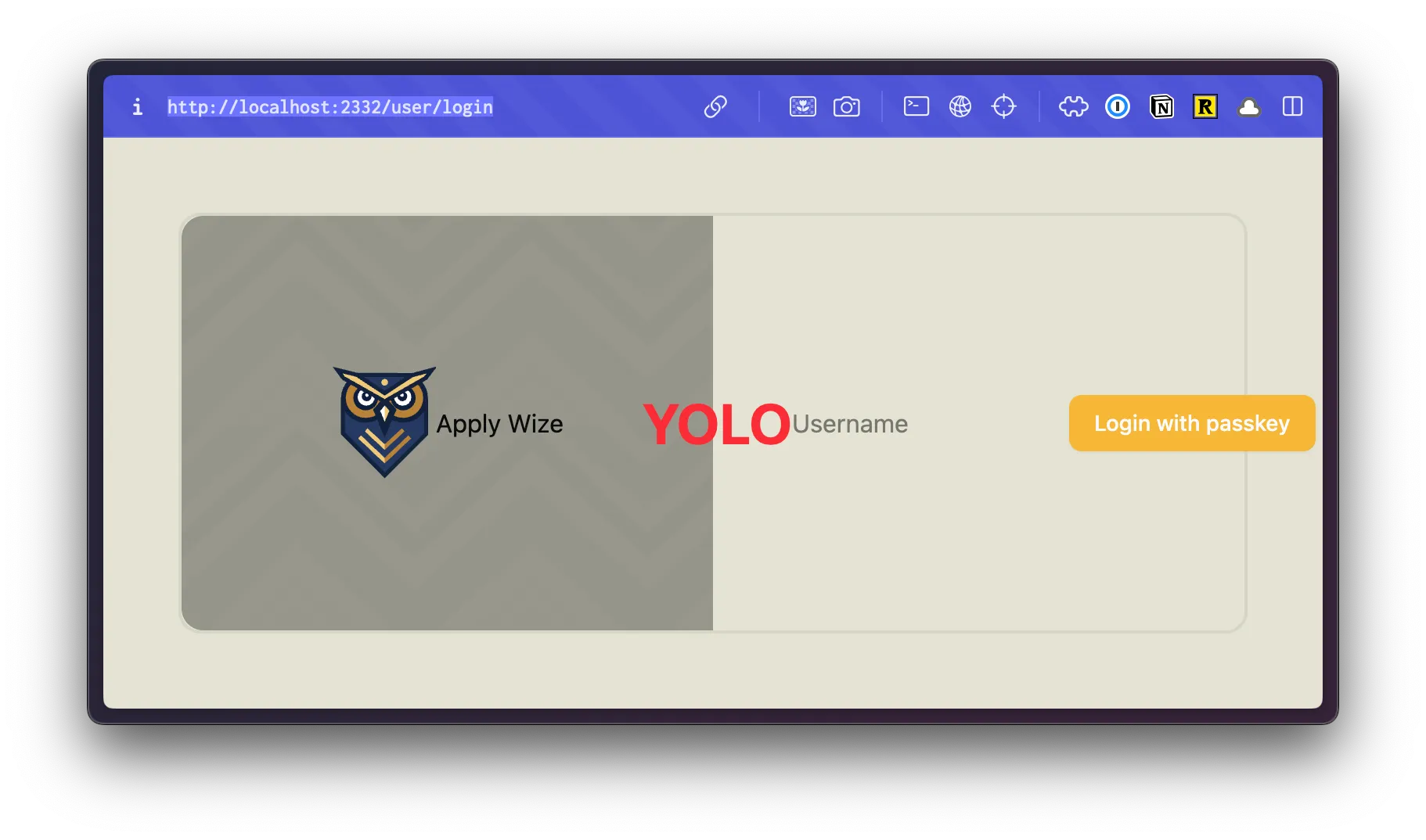
It’s centering our content, but it’s also horizontally aligning everything. Let’s wrap our column content with another div.
return ( <div className="bg-bg min-h-screen min-w-screen p-12"> <div className="grid grid-cols-2 min-h-[calc(100vh-96px)] rounded-xl border-2 border-[#D6D5C5]"> <div className="center bg-[url('/images/bg.png')] bg-repeat rounded-l-xl"> <div> <img src="/images/logo.svg" alt="Apply Wize" /> <div>Apply Wize</div> </div> </div> <div className="center"> <div>{children}</div> </div> </div> </div>);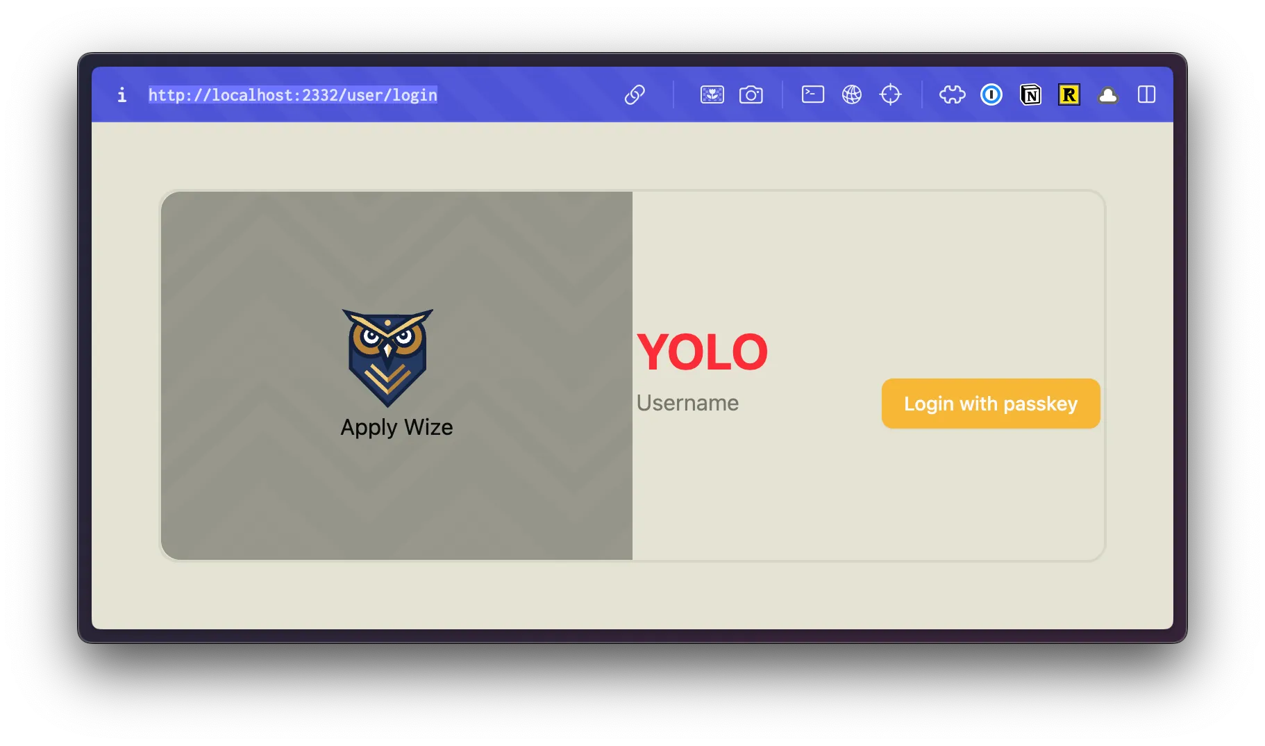
To center the owl, we can use the mx-auto class. This will set the left and right margins to auto.
<img src="/images/logo.svg" alt="Apply Wize" className="mx-auto" />Now, let’s style the Apply Wize text.
<div className="text-5xl text-white font-bold">Apply Wize</div>- We'll set the font size
48pxwithtext-5xl - The color to white with
text-white - The font weight to bold with
font-bold
In our mock-up, we also had a quote in the bottom left corner:
“Transform the job hunt from a maze into a map.”
We want this to be fixed to the bottom of the left column. So, this needs to be inside our left column div, but outside of the div containing our logo.
<div className="center bg-[url('/images/bg.png')] bg-repeat rounded-l-xl"> <div> <img src="/images/logo.svg" alt="Apply Wize" className="mx-auto" /> <div className="text-5xl text-white font-bold">Apply Wize</div> </div> <div>"Transform the job hunt from a maze into a map."</div></div>To style the text:
<div className="text-white text-sm absolute bottom-0 left-0 right-0 p-10"> “Transform the job hunt from a maze into a map.”</div>- We want to it to be white,
text-whiteand small (14px)text-sm - Then, we can position it absolutely to the bottom left corner with
absolute bottom-0 left-0 - We want to add a little bit of spacing from the edge with
p-10which is40pxof padding
This looks good-ish. The text is styled correctly, but the placement is off. We could adjust our our top and left values, but that’s not the real problem. In CSS, positioning is relative. Meaning, it takes the parent container and it’s positioning into consideration.
Our parent div doesn’t have any positioning applied (by default it’s static). Therefore, it looks to the page. And, yes, our quote is positioned to the bottom left corner of the page, with 40px of padding.
If we add a class of relative to our parent div, then it will position our quote relative to the parent container.
<div className="relative center bg-[url('/images/bg.png')] bg-repeat rounded-l-xl">If you take a look inside the browser:
Notice, this also allows our quote to “live” inside the container and wrap appropriately.
It’s tempting to call the styling for the left side done, but with the quote it looks bottom heavy. Even though the logo is programmatically centered, it’s not optically centered. We can shift it up:
<div className="-top-[100px] relative"> <img src="/images/logo.svg" alt="Apply Wize" className="mx-auto" /> <div className="text-5xl text-white font-bold"> Apply Wize </div></div>- We moved the logo up
100pxwith-top-[100px] - In order for
topto work, we need also need to add a position ofrelative, so that the browser knows we're moving it relative to it's current position.
If we take a look in the browser:
The left side is finished! 🎉
Now, let’s style the right side. This is easy!
<div className="center bg-white rounded-r-xl"> <div className="w-full">{children}</div></div>- The background should be white:
bg-white - And the corners on the right should be rounded,
rounded-r-xl - For the
divthat wraps{children}, we want it to take the full width of it's container withw-full
The styling for AuthLayout component is complete 🎉.
Final src/app/layouts/AuthLayout.tsx code
import { type LayoutProps } from "rwsdk/router";
const AuthLayout = ({ children }: LayoutProps) => { return ( <div className="bg-bg min-h-screen min-w-screen p-12"> <div className="grid grid-cols-2 min-h-[calc(100vh-96px)] rounded-xl border-2 border-[#D6D5C5]"> <div className="relative center bg-[url('/images/bg.png')] bg-repeat rounded-l-xl"> <div className="-top-[110px] relative"> <img src="/images/logo.svg" alt="Apply Wize" className="mx-auto" /> <div className="text-5xl text-white font-bold">Apply Wize</div> </div> <div className="text-white text-sm absolute bottom-0 left-0 right-0 p-10"> "Transform the job hunt from a maze into a map." </div> </div> <div className="center bg-white rounded-r-xl"> <div className="w-full">{children}</div> </div> </div> </div> );};
export { AuthLayout };Styling the Login Content
Section titled “Styling the Login Content”Now, we can jump over to our Login component and style it.
First we can delete our h1, YOLO text.
<h1 className="text-4xl font-bold text-red-500">YOLO</h1>Let’s also remove the bg-bg class from our wrapping main tag.
<main className="bg-bg">Now, let’s just work from top to bottom.
In the top, right corner, we have a link to the signup page. This is similar to how we styled the quote in our layout component, except this time we want it positioned to the top, right corner.
return ( <main> <div className="absolute top-0 right-0 p-10"> <a href="#" className="font-display font-bold text-black text-sm underline underline-offset-8 hover:decoration-primary"> Register </a> </div> ...- We're positioning the link with
absoluteto the top right,top-0 right-0and addingp-10or40pxof padding - For the Register link, we want to use the font Poppins or
font-display, make it boldfont-bold, blacktext-black, and smalltext-sm - I want to make sure this looks like a link. Let's add a class of
underlineand offset withunderline-offset-8to give it some space from the text. Then, when we hover, let's just change the underline color withhover:decoration-primary
Now, we have the same positioning “problem” that we had with our quote. We need the link to be positioned relative to the container. Let’s go back to the AuthLayout component and add a class of relative:
<div className="center bg-white rounded-r-xl relative"> <div className="w-full">{children}</div></div>Next up, let’s wrap all of our form content with a div and add the text at the top of our form:
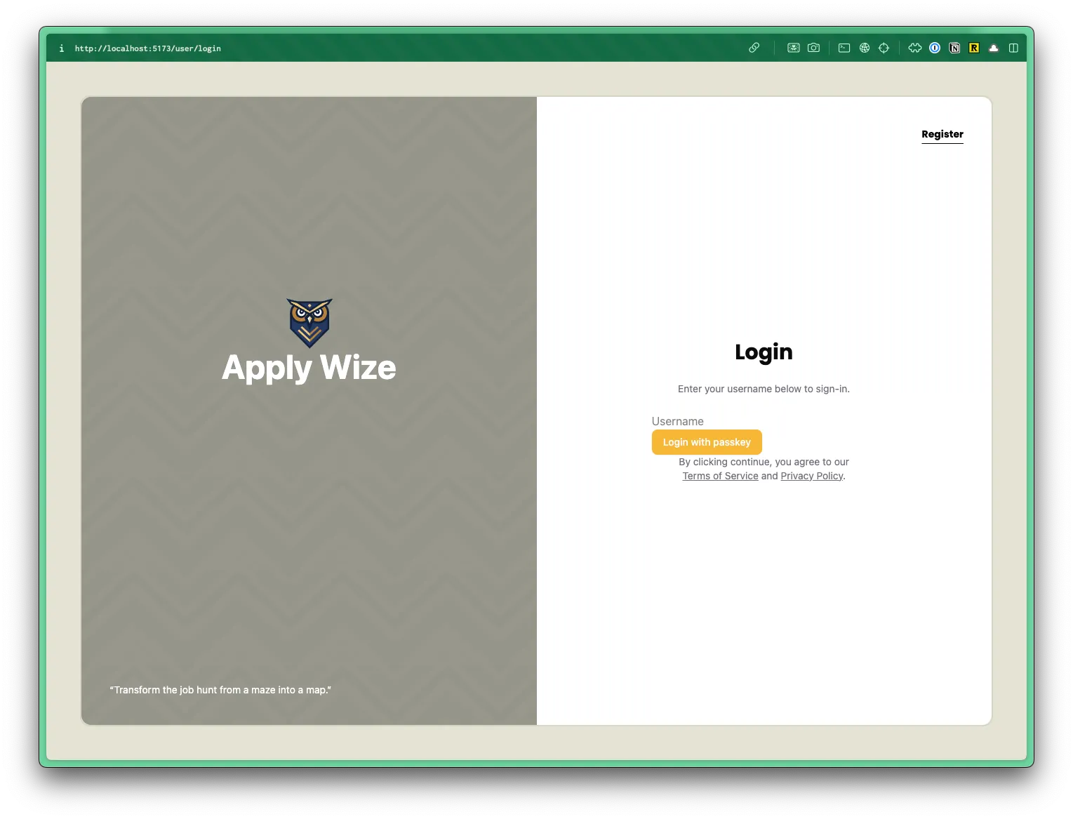
<div className="max-w-[400px] w-full mx-auto px-10"> <h1 className="text-center">Login</h1> <p className="py-6">Enter your username below to sign-in.</p>
<input type="text" value={username} onChange={(e) => setUsername(e.target.value)} placeholder="Username" /> <Button onClick={handlePerformPasskeyLogin} disabled={isPending}> {isPending ? <>...</> : "Login with Passkey"} </Button> {result && <div>{result}</div>}</div>- On our wrapping
divI don't want the content to be more than400pxwide withmax-w-[400px]. But, I want it to take up as much space as possible withw-full. - I want it to be centered with
mx-auto. - On smaller screens, I want to ensure there's some horizontal padding with
px-10 - Our
h1should be centered withtext-center - I also want to add some vertical spacing with
py-6
Let’s also add some text below our form:
<Button onClick={handlePerformPasskeyLogin} disabled={isPending} className="font-display w-full mb-6"> {isPending ? <>...</> : "Login with passkey"}</Button>{result && <div>{result}</div>}<p>By clicking continue, you agree to our <a href="#">Terms of Service</a> and <a href="#">Privacy Policy</a>.</p>I want to add some more styling, but I want to be able to reuse these styles on our Signup page, so let’s stick these updates inside our styles.css file.
In CSS order matters. The @layer CSS at-rule makes it easy to declare a layer and set the order of preference.
I like to order my CSS:
- Base styles are at the top. These are for styling generic HTML elements. No classes, just tags.
- Component styles. These are for styling classes that get used across multiple components and pages.
- Page specific styles. These are for styling elements on a specific page.
Based on this ordering, we get more specific as we move down the file.
Let’s start by setting up @layer for each grouping.
At the very bottom of our styles.css file, we already have a @layer base that shadcn/ui created.
@layer base, components, page;
@layer base { * { @apply border-border outline-ring/50; } body { @apply bg-background text-foreground; }}
@layer components {}
@layer page {}For all our headings (h1, h2, h3, etc.), we want to use the font Poppins, font-display, and make it bold font-bold. Let’s stick this inside our base layer:
@layer base { ... h1, h2, h3 { @apply font-display font-bold; }}Then, let’s also add some more specific styles for our h1 since it’s a page title:
@layer components { .page-title { @apply text-3xl }}- We're setting the font size to
30pxwithtext-3xl
Back in our Login component, let’s add the class of page-title to our h1:
<h1 className="page-title text-center">Login</h1>We have a couple of paragraphs of text, but I only want these classes to be applied to paragraphs on our authentication pages. Let’s add a class of auth-form to our wrapping div:
<div className="auth-form max-w-[400px] w-full mx-auto px-10"> <h1 className="text-center page-title">Login</h1> <p className="py-6">Enter your username below to sign-in.</p> <input type="text" value={username} onChange={(e) => setUsername(e.target.value)} placeholder="Username" /> <Button onClick={handlePerformPasskeyLogin} disabled={isPending}> {isPending ? <>...</> : "Login with passkey"} </Button> {result && <div>{result}</div>} <p> By clicking continue, you agree to our{" "} <a href="#">Terms of Service</a> and <a href="#">Privacy Policy</a>. </p></div>In our styles.css file, let’s target the auth-form class:
@layer page { .auth-form { p { @apply text-sm text-zinc-500 text-center; a { @apply text-zinc-500 hover:text-black underline whitespace-nowrap; } } }}- You'll notice I'm using CSS nesting to target the
pandatags inside theauth-formclass. This gets rendered as.auth-form pand.auth-form p a. - For the paragraph, I want the text to be small
text-sm, graytext-zinc-500(this is a Tailwind color), and centeredtext-center. - For a link inside our paragraph, the color should be gray
text-zinc-500, but when we hover over it, it should be blackhover:text-black. - Let's
underlinethe link so that we it's obvious it's a link. - I'm also going to add a class of
whitespace-nowrapto prevent the link from wrapping to a new line. Meaning, "Terms of Service" or "Privacy Policy" will fit on a single line.
If we take a look in the browser, this looks great. The only thing we lack is the input field and button styles. Let’s head back to our styles.css file:
@layer base { ... input[type="text"] { @apply border-border border-1 rounded-md px-3 h-9 block w-full mb-2 text-base; }}- Let's target an
inputwith atypeoftextwithinput[type="text"]. Since, we're styling a base tag, we can stick this in thebaselayer. - We want to add a border with a color of border
border-borderand a width of1pxwithborder-1. - Let's round the corners with
rounded-md - Add some horizontal padding
px-3 - Set the height to
36pxwithh-9 - Give our input a
displayofblock. This ensure that theinputhas it's own line. - It should span the entire width of its container
w-full. - Let's add some spacing to the bottom with
mb-2(8px) - Set the font size to
16pxwithtext-base
For the button, we’re using the shadcn/ui button component. Let’s crack it open:
const buttonVariants = cva( "font-bold inline-flex items-center justify-center gap-2 whitespace-nowrap rounded-md text-sm font-medium transition-all disabled:pointer-events-none disabled:opacity-50 [&_svg]:pointer-events-none [&_svg:not([class*='size-'])]:size-4 shrink-0 [&_svg]:shrink-0 outline-none focus-visible:border-ring focus-visible:ring-ring/50 focus-visible:ring-[3px] aria-invalid:ring-destructive/20 dark:aria-invalid:ring-destructive/40 aria-invalid:border-destructive", { variants: { variant: { default: "bg-primary text-primary-foreground shadow-xs hover:bg-primary/90",22 collapsed lines
destructive: "bg-destructive text-white shadow-xs hover:bg-destructive/90 focus-visible:ring-destructive/20 dark:focus-visible:ring-destructive/40 dark:bg-destructive/60", outline: "border bg-background shadow-xs hover:bg-accent hover:text-accent-foreground dark:bg-input/30 dark:border-input dark:hover:bg-input/50", secondary: "bg-secondary text-secondary-foreground shadow-xs hover:bg-secondary/80", ghost: "hover:bg-accent hover:text-accent-foreground dark:hover:bg-accent/50", link: "text-primary underline-offset-4 hover:underline", }, size: { default: "h-9 px-4 py-2 has-[>svg]:px-3", sm: "h-8 rounded-md gap-1.5 px-3 has-[>svg]:px-2.5", lg: "h-10 rounded-md px-6 has-[>svg]:px-4", icon: "size-9", }, }, defaultVariants: { variant: "default", size: "default", }, })- Near the top of the file, there's a variable called
buttonVariantsthat contains all the Tailwind styling. - Let's make the button text bold by adding a class of
font-boldwithin the first list of classes. This ensures that all button variants will be bold. You'll also need to removefont-mediumfrom the list. Otherwise, the two classes will conflict. - The first variant is the
defaultvariant and has a class ofbg-primary. This is why our button is using our yellow, primary color. We've already set--color-primarywithin ourstyles.cssfile.
The button text is appearing white because of the text-primary-foreground class. Lets’ remove this class and add a text-black class:
variant: { default: "bg-primary text-primary-foreground text-black shadow-xs hover:bg-primary/90",Let’s also add a few specific classes just for login button. I don’t want this to get applied by default to every button we use, so I’m going to apply these to the Button component on the Login page.
<Button onClick={handlePerformPasskeyLogin} disabled={isPending} className="font-display w-full mb-6"> {isPending ? <>...</> : "Login with passkey"}</Button>- At the end of our
Buttoncomponent, let's add classes to use the font Poppins,font-display, make the button span the full width of its containerw-full, and add some spacing to the bottom withmb-6
Let’s take a look at the final result within the browser:
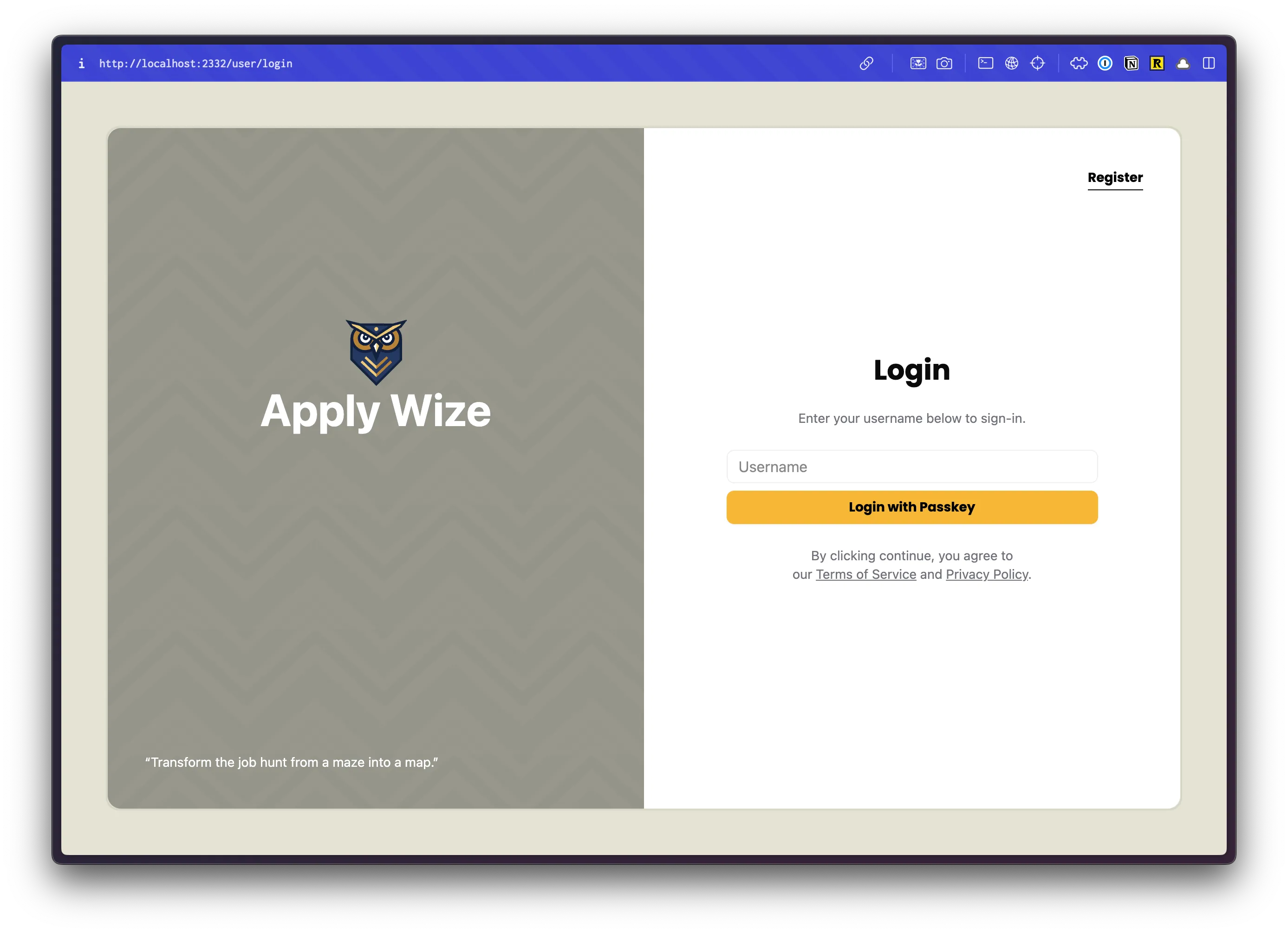
👏 Well done!
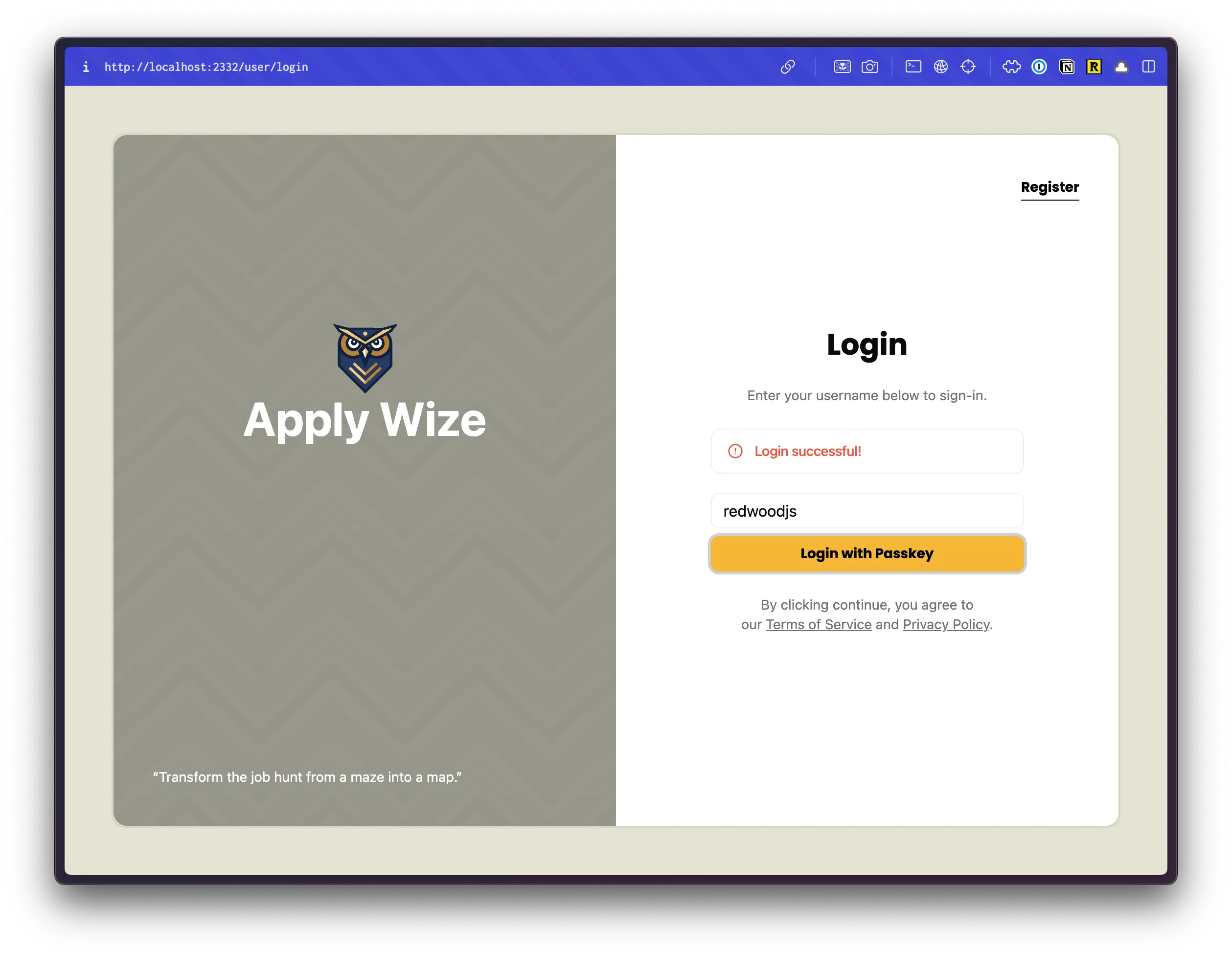
But, there’s one more thing. Let’s move the result message at the bottom of the form to the top.
<div className="auth-form max-w-[400px] w-full mx-auto px-10">  <h1 className="page-title text-center">Login</h1>  <p className="py-6">Enter your username below to sign-in.</p>  {result && <div>{result}</div>}
6 collapsed lines  <input    type="text"    value={username}    onChange={(e) => setUsername(e.target.value)}    placeholder="Username"  />  <Button    onClick={handlePerformPasskeyLogin}    disabled={isPending}    className="font-display w-full mb-6"  >    {isPending ? <>...</> : "Login with passkey"}  </Button>  {result && <div>{result}</div>}  <p>    By clicking continue, you agree to our{" "}    <a href="#">Terms of Service</a> and <a href="#">Privacy Policy</a>.  </p></div>
We can also style this, using an <Alert /> shadcn/ui component. We just need to import our component at the top and wrap our {result}.
import { Alert, AlertTitle } from "@/app/components/ui/alert";import { AlertCircle } from "lucide-react";...{result && ( <Alert variant="destructive" className="mb-5"> <AlertCircle className="h-4 w-4"/> <AlertTitle>{result}</AlertTitle> </Alert>)}Alert,AlertCircle, andAlertTitleare all from the shadcn/uiAlertcomponent. You can find the full documentation here.- Let's set the
varianttodestructive - and add some margin to the bottom with
mb-5
You’ll need to login (successfully or unsuccessfully) to see the alert.
I know, it feels strange to see a red alert message when we were able to successfully login. But, really, if we were able to login successfully, we want to be redirected to the homepage. We can update the passkeyLogin function (starts on line 16):
const passkeyLogin = async () => {9 collapsed lines
// 1. Get a challenge from the worker const options = await startPasskeyLogin();
// 2. Ask the browser to sign the challenge const login = await startAuthentication({ optionsJSON: options });
// 3. Give the signed challenge to the worker to finish the login process const success = await finishPasskeyLogin(login);
if (!success) { setResult("Login failed"); } else { setResult("Login successful!"); window.location.href = "/"; }};- If we weren't successful, it will still set the result message to "Login failed."
- If we were successful, it will redirect us to the homepage.
🥳 Excellent!
But, there’s one more thing (there’s always one more thing). We need to add links to our Register, Terms of Service, and Privacy Policy pages.
Linking between the Login and Signup Pages
Section titled “Linking between the Login and Signup Pages”We could make our links “simple” and use something like this:
<a href="/register">Register</a>This will definitely get us where we want to go. The only problem is, it’s not type safe and prone to typos.
Within our src/app/shared folder, there’s a file inside called links.ts.
import { defineLinks } from "rwsdk/router";
export const link = defineLinks(["/", "/user/login", "/user/logout"]);At first glance, this file is a little sparse.
- On line 1, we're importing the
defineLinksfrom the RedwoodSDK. - On line 3, we're defining an array of all our links or routes. Right now, there's are three:
- Our home page, at
"/" - Our login page, at
/user/login - Our logout page, at
/user/logout
- Our home page, at
Let’s add reference links for our other pages:
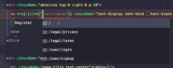
export const link = defineLinks([ "/", "/user/login", "/user/signup", "/user/logout", "/legal/privacy", "/legal/terms",]);Now, let’s go back to our Login component and update our Register link.
import { link } from "@/app/shared/links";...<a href={link("/user/signup")} className="font-display font-bold text-black text-sm underline underline-offset-8 hover:decoration-primary"> Register</a>- At the top of our file, let's import our
linkfunction. - Then, within our Register
atag, let's set thehreftolink('/user/signup').
As you type, you should see VS Code make recommendations based on the contents of our links.ts file.
We can make similar changes to our Terms of Service and Privacy Policy links:
<p> By clicking continue, you agree to our{" "} <a href={link("/legal/terms")}>Terms of Service</a> and{" "} <a href={link("/legal/privacy")}>Privacy Policy</a>.</p>If you check your work in the browser, the register link works great, but our Terms of Service and Privacy Policy links go to a Not Found page. Let’s fix that.
We’ll do a quick “duct tape” solution for now, but we’ll eventually circle back around.
Within our src/worker.tsx file, we’re exporting defineApp. Remember, this includes definitions for all our middleware and routes.
export default defineApp([29 collapsed lines
setCommonHeaders(), async ({ ctx, request, headers }) => { await setupDb(env); setupSessionStore(env);
try { ctx.session = await sessions.load(request); } catch (error) { if (error instanceof ErrorResponse && error.code === 401) { await sessions.remove(request, headers); headers.set("Location", "/user/login");
return new Response(null, { status: 302, headers, }); }
throw error; }
if (ctx.session?.userId) { ctx.user = await db.user.findUnique({ where: { id: ctx.session.userId, }, }); } }, render(Document, [ route("/", () => new Response("Hello, World!")),11 collapsed lines
route("/protected", [ ({ ctx }) => { if (!ctx.user) { return new Response(null, { status: 302, headers: { Location: "/user/login" }, }); } }, Home, ]), layout(AuthLayout, prefix("/user", userRoutes)), route("/legal/privacy", () => <h1>Privacy Policy</h1>), route("/legal/terms", () => <h1>Terms of Service</h1>), ]),]);- On line 63, let's add a new
routedefinition to our array for our privacy policy page. Theroutefunction takes two parameters. The first parameter is the path or the URL. The second parameter is the response. This could be a standard HTML response object or JSX/TSX. For our quick solution, we're inlining JSX. - On line 64, we're doing the exact same thing for our Terms page.
Now, if you check your work in the browser, you should see the Terms of Service and Privacy Policy links working.
Styling the Signup Page
Section titled “Styling the Signup Page”😅 Don’t worry, we’ve already done all the heavy lifting. This will be a breeze, because we already wrapped our UserRoutes with a layout function.
Let’s start by removing our YOLO heading and the bg-bg class on our wrapping main tag:
return ( <main className="bg-bg"> <h1 className="text-4xl font-bold text-red-500">YOLO</h1>Now, let’s add a login link at the top of our signup page:
import { link } from "@/app/shared/links";... return ( <main> <div className="absolute top-0 right-0 p-10"> <a href={link("/user/login")} className="font-display font-bold text-black text-sm underline underline-offset-8 hover:decoration-primary" > Login </a> </div> ...- Our Login link is using the exact same styles as the Register link on the Login page. The only difference is we changed the link to point to our
/user/loginroute and the label isLogin.
Next, let’s wrap all of our content with a div:
return ( <main> <div className="auth-form max-w-[400px] w-full mx-auto px-10">18 collapsed lines
<div className="absolute top-0 right-0 p-10"> <a href={link("/user/login")} className="font-display font-bold text-black text-sm underline underline-offset-8 hover:decoration-primary" > Login </a> </div> <input type="text" value={username} onChange={(e) => setUsername(e.target.value)} placeholder="Username" /> <Button onClick={handlePerformPasskeyRegister} disabled={isPending}> {isPending ? <>...</> : "Register with passkey"} </Button> {result && <div>{result}</div>} </div> </main> );- We're using the same styles as our login page.
- We have a class
auth-formthat will style ourpandatags. - We've set the maximum width of our form to
400px, but we want it to take up as much space as possiblemin-w-full. - Center it on the page
mx-auto. - Added
40pxpadding to the left and right withpx-10.
Before our input tag, let’s add a heading and a paragraph:
<h1 className="page-title text-center">Create an Account</h1><p className="py-6">Enter a username to setup an account.</p>6 collapsed lines
<input type="text" value={username} onChange={(e) => setUsername(e.target.value)} placeholder="Username"/>Let’s move our result message to appear right below our heading:
import { Alert, AlertTitle } from "@/app/components/ui/alert";import { AlertCircle } from "lucide-react";...<h1 className="page-title text-center">Create an Account</h1><p className="py-6">Enter a username to setup an account.</p>{result && ( <Alert variant="destructive" className="mb-5"> <AlertCircle className="h-4 w-4"/> <AlertTitle>{result}</AlertTitle> </Alert>)}9 collapsed lines
<input type="text" value={username} onChange={(e) => setUsername(e.target.value)} placeholder="Username"/><Button onClick={handlePerformPasskeyRegister} disabled={isPending}> {isPending ? <>...</> : "Register with passkey"}</Button>{result && <div>{result}</div>}Jumping down a little bit, on our Button component, let’s add a few classes to the end:
<Button onClick={handlePerformPasskeyRegister} disabled={isPending} className="font-display w-full mb-6"> {isPending ? <>...</> : "Register with passkey"}</Button>- We want to use the font Poppins,
font-display. - Make the button span the entire width of the container,
w-full. - Add some spacing to the bottom,
mb-6.
Then, right below the button, we can add our legal statement:
<p> By clicking continue, you agree to our <a href={link("/legal/terms")}>Terms of Service</a> and <a href={link("/legal/privacy")}>Privacy Policy</a>.</p>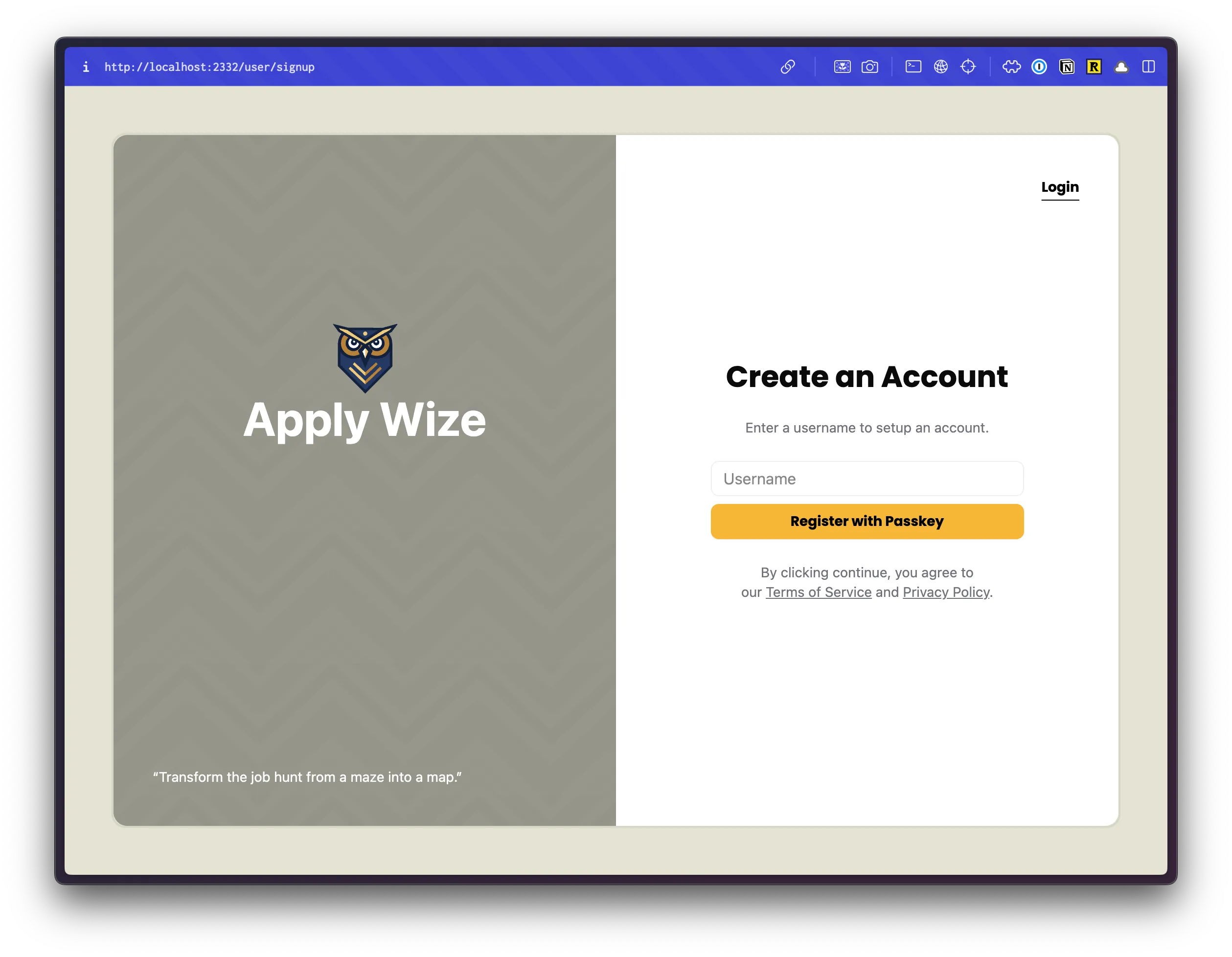
See, I told you! Easy peasy. 🍋